
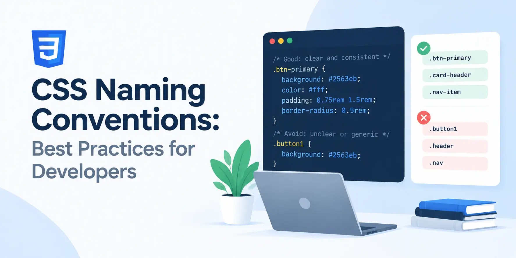
CSS does not have modules. There is no import statement that scopes a rule to
one file, no package boundary, and no private keyword. Every class name you write lives in
the same global namespace as every other class name on the page.
That single fact explains why CSS naming is so much harder than it looks. A rule is never really “local” — it is a global instruction that says “anywhere an element carries this class, style it this way.” Get the name vague, and it will eventually match something you did not intend. Get it specific, and you can change a component with confidence.
This guide covers the conventions that hold up over time: naming by purpose rather than appearance, the formatting rules, BEM and the other major methodologies, state and namespace prefixes, and the mistakes that make a stylesheet impossible to maintain.
Why CSS Naming Is Hard
In most languages, a badly named variable is a local problem. It is annoying to read, but it only affects the function it lives in. In CSS, a badly named class is a global problem.
Consider a class called .box. It sounds harmless. But it lives in one global
namespace alongside every other class in the project, and nothing stops a developer in a
completely different part of the codebase from writing the same name for something else.
/* Written by one developer, for a promo banner */
.box {
    padding: 24px;
    border: 2px solid #0891b2;
}

/* Written months later, by someone else, for a pricing table */
.box {
    padding: 8px;
    border: 0;
    background: #f8fafc;
}

/* Both rules now apply to every element with class="box".
   The second one wins on padding and border because it comes later. */
Nothing warned anyone. No import failed, no type check caught it, no test broke. Two unrelated components silently interfered with each other, and the bug shows up as “the promo banner looks wrong on the pricing page.”
The four problems a naming convention solves
Collisions
Generic names like .box, .card, .title, and
.content get reinvented independently across a project and end up
fighting each other.
Ambiguity
A name like .highlight could mean a background color, a border, a bold
font, or an entire callout box. Nobody can predict what changing it will affect.
Stale meaning
A class called .red-button becomes a lie the moment the brand color
changes, and now the name actively misleads every future reader.
Unfindable rules
When a component breaks, you need to find its CSS quickly. Scattered, inconsistently named rules turn a two-minute fix into an hour of searching.
Ask yourself: “if I deleted this rule, what would break?” If you cannot answer that
without opening the browser and looking, the name is too vague. A good name makes the
answer obvious — .pricing-card__price can only affect the price inside a
pricing card.
The Core Principle: Name by Purpose, Not Appearance
If you take one idea from this guide, take this one. Everything else is detail.
A class name should describe what the element is, not how it currently looks. Appearance changes constantly — brand colors are revised, designs are refreshed, dark mode is added. Purpose rarely does.
.red-button
Names the appearanceNow the brand color is teal. The class still says red, and the CSS still sets red, but nobody dares change it because the name would become even more wrong.
Six months later there are four button colors and three of them are lies.
.btn–danger
Names the purposeThis is the button that performs a destructive action. The brand color can change; the meaning does not.
Restyle it freely. The name stays correct forever.
What this looks like in practice
Names a color that will change.
Names the region of the page.
Names a size that will change.
Names the role in the content.
Names a position that breaks on mobile.
Names the region, wherever it sits.
Leaks a number into the name.
Names the part of a component.
Utility-first frameworks such as Tailwind deliberately break this rule. A class called
.mt-4 is its appearance, on purpose — it is a single-purpose tool,
not a component name. The purpose-over-appearance rule applies to
components, not to utility atoms.
Formatting Rules
Before choosing a methodology, get the mechanics right. These are the rules that keep a name valid, readable, and safe across browsers and tools.
Use kebab-case
Lowercase words separated by hyphens is the convention, and it is the safest choice:
/* Recommended */
.card-header { }
.pricing-table { }
.nav-primary { }

/* Works, but not the convention */
.cardHeader { }
.pricing_table { }
.NavPrimary { }
There are three practical reasons for lowercase kebab-case. Class names are case-sensitive, so mixing cases invites mismatches between the HTML and the CSS. Some servers and build tools treat file names case-insensitively, which makes consistency harder to enforce. And hyphens keep every BEM separator visually distinct.
A single underscore works fine in CSS. The problem is that BEM uses double
underscores as its element separator, so a name like .card_title sits
dangerously close to .card__title and is easy to mistype. Pick hyphens and
stay consistent.
The mechanical rules
- Start with a letter. A class may not begin with a digit —
.2colis invalid,.col-2is fine. - Use letters, digits, hyphens, and underscores. Other characters need escaping, which is a sign you should rename it.
- Lowercase only. Class matching is case-sensitive in standards mode, so
.Cardand.cardare different names. - No spaces. Obvious, but a space in a class name splits it into two separate classes in the HTML.
- Avoid semantic-free abbreviations.
.usr-prfl-crdis shorter and much harder to read than.user-profile-card.
How long should a name be?
Long enough to be unambiguous, short enough to read. Two or three words usually covers it.
A slightly long name like .site-header__nav-link--active is a fair trade — it
says exactly what it is and where it lives, and you only type it once.
.box { }
.title { }
.link { }
.item { }
.content { }

/* Could any of these be
changed safely? */.pricing-card { }
.pricing-card__title { }
.pricing-card__link { }
.pricing-card__feature { }
.pricing-card__body { }
/* Every name says where
it belongs */BEM: Block, Element, Modifier
BEM is the most widely used structured naming convention in CSS. It has three parts, and once you know them you can read any BEM class name at a glance.
What it looks like in the HTML
<!DOCTYPE html>
<html lang="en">
<head>
    <meta charset="UTF-8">
    <title>BEM in Practice</title>
    <style>
        body {
            font-family: system-ui, sans-serif;
            background: #f8fafc;
            padding: 28px;
            margin: 0;
        }

        /* Block */
        .card {
            background: #fff;
            border: 1px solid #e2e8f0;
            border-radius: 14px;
            padding: 22px;
            max-width: 340px;
            transition: transform 0.2s ease, box-shadow 0.2s ease;
        }

        /* Modifier — applied alongside .card */
        .card--featured {
            border-color: #0891b2;
            box-shadow: 0 0 0 3px rgba(8, 145, 178, 0.12);
        }

        /* Elements — always scoped to the block */
        .card__title {
            margin: 0 0 8px;
            font-size: 1.1rem;
            color: #0f172a;
        }

        .card__text {
            margin: 0 0 14px;
            font-size: 0.92rem;
            line-height: 1.65;
            color: #64748b;
        }

        .card__link {
            color: #0891b2;
            font-weight: 600;
            font-size: 0.88rem;
            text-decoration: none;
            border-bottom: 2px solid #0891b2;
        }

        /* Element modifier */
        .card__link--muted {
            color: #64748b;
            border-bottom-color: #cbd5e1;
        }
    </style>
</head>
<body>

    <!-- A plain card: just the block and its elements -->
    <article class="card" style="margin-bottom: 18px;">
        <h2 class="card__title">Standard card</h2>
        <p class="card__text">
            Only the block class and element classes are present.
        </p>
        <a class="card__link" href="#">Read more</a>
    </article>

    <!-- A featured card: block + modifier, plus an element modifier -->
    <article class="card card--featured">
        <h2 class="card__title">Featured card</h2>
        <p class="card__text">
            The block carries a modifier, and the link carries one too.
        </p>
        <a class="card__link card__link--muted" href="#">Dismiss</a>
    </article>

</body>
</html>
Read the class attributes carefully. The featured card is
class="card card--featured" — both classes, not just the modifier. The
modifier only overrides the properties that change; everything else still comes from
.card.
class="card--featured" on its own is a mistake. The modifier assumes the
base block is present, so writing it without .card leaves the element with
the border but none of the padding, background, or radius.
What BEM gives you
Self-documenting structure
A name tells you which component it belongs to before you open the stylesheet.
Flat specificity
Every selector is a single class, so the cascade stays predictable and easy to override.
No accidental collisions
Element names are always prefixed by their block, so .card__title cannot clash with .post__title.
Safe deletion
Searching for a block name finds every rule and every use in the HTML in one pass.
What BEM costs you
BEM class names are long. .site-header__nav-link--active is twenty-nine
characters, and typing it in a template is tedious. That is a real cost, and it is the main
reason some teams choose an alternative.
It is also verbose in the HTML: an element often carries two or three classes. In practice most teams find the trade worthwhile, because the alternative — vague names that collide — costs far more time than the extra typing.
BEM is a convention, not a requirement. What matters is that your team picks something consistent and applies it everywhere. A project with a clear custom convention is far healthier than one with BEM applied inconsistently.
Other Naming Methodologies
BEM is the most common, but it is not the only structured approach. Each of the others solves a slightly different problem, and each has real trade-offs.
Object-Oriented CSS
Separates structure from skin, and content from container. A layout class handles positioning; a theme class handles appearance.
.media + .media--inverted
Scalable and Modular
Groups rules into five categories — base, layout, module, state, and theme — each with its own naming prefix convention.
.l-header, .is-active
Utility-First
Small single-purpose classes that each set one or two properties. Styles are composed in the HTML rather than in a stylesheet.
.mt-4, .text-center
| Approach | Naming style | Best for | Main drawback |
|---|---|---|---|
| BEM | block__element--modifier |
Component libraries and large team projects | Long, verbose class names |
| OOCSS | Structure and skin separated | Reusable layout primitives | Requires discipline to keep the split clean |
| SMACSS | Category prefixes | Projects that want a clear file taxonomy | More convention to learn up front |
| Atomic / Utility | Property-based utility classes | Rapid prototyping and consistent design systems | Verbose HTML, and a learning curve for newcomers |
| CSS Modules | Locally scoped, auto-hashed | Component-based frameworks | Requires a build step |
CSS Modules and scoped styles
Modern build tooling changed the problem in a different way. CSS Modules, Vue’s scoped
styles, and similar systems generate a unique suffix for every class name at build time, so
.card in one file becomes something like .card_a3f8d in the
output. The names never collide because they are never the same name.
/* What you write */
.card { padding: 24px; }

/* What the browser receives */
.card_a3f8d { padding: 24px; }
This removes the collision problem entirely, but it does not remove the readability problem. A name still has to communicate what the component is to the next developer, which is why purpose-based naming matters in every system.
A five-page marketing site does not need BEM. A design system used by six teams does not survive without something like it. Match the convention to the size of the problem, and write it down so everyone follows the same rules.
Naming States and Variants
A component can be in several states — open, active, disabled, loading, selected. These are not variants in the design sense; they change while the user interacts with the page. The convention is a short prefix that makes the state obvious.
.is-open,
.is-active, .is-disabled, .is-loading. Always
used together with a component class, never alone.
.has-error,
.has-children, .has-icon. Useful when the presence of
something inside changes the container.
.js-toggle,
.js-modal. These should carry no styling at all, so the visual classes can
be refactored freely.
.l-grid, .l-container. Marks
a rule that handles positioning only, never appearance.
.u-hidden,
.u-visually-hidden, .u-text-center. Single-purpose, and often
marked !important so it always wins.
States on a component
<!DOCTYPE html>
<html lang="en">
<head>
    <meta charset="UTF-8">
    <title>State Naming</title>
    <style>
        body { font-family: system-ui, sans-serif; padding: 28px; background: #f8fafc; }

        .accordion {
            background: #fff;
            border: 1px solid #e2e8f0;
            border-radius: 12px;
            max-width: 380px;
            overflow: hidden;
        }

        .accordion__header {
            padding: 16px 18px;
            font-weight: 600;
            color: #0f172a;
            background: #f8fafc;
            border-bottom: 1px solid #e2e8f0;
        }

        .accordion__panel {
            padding: 16px 18px;
            color: #475569;
            font-size: 0.92rem;
            line-height: 1.65;

            /* closed by default */
            display: none;
        }

        /* State: the component is open */
        .accordion.is-open .accordion__panel {
            display: block;
        }

        /* State: the header reflects the open state */
        .accordion.is-open .accordion__header {
            background: #0891b2;
            color: #fff;
            border-bottom-color: #0891b2;
        }

        /* State: a utility that hides anything */
        .u-hidden {
            display: none !important;
        }

        /* A hook used only by JavaScript, never styled */
        /* .js-accordion { } */
    </style>
</head>
<body>

    <div class="accordion js-accordion is-open">
        <div class="accordion__header">Open state</div>
        <div class="accordion__panel">
            The block carries both a JavaScript hook and a state class.
        </div>
    </div>

    <div class="accordion js-accordion" style="margin-top: 14px;">
        <div class="accordion__header">Closed state</div>
        <div class="accordion__panel">
            Without the is-open class, the panel stays hidden.
        </div>
    </div>

</body>
</html>
Notice the class list on the first accordion: accordion js-accordion is-open.
Three classes, three jobs. The block gives it structure, the js- hook gives
JavaScript something to bind to, and the state class describes its current condition.
When a class is used by JavaScript, renaming it breaks behaviour in a way that is not
obvious from the CSS. Prefixing those hooks with js- means a developer can
restyle the entire component — rename every visual class — without touching a single line
of JavaScript.
Namespacing and File Organization
A naming convention works best when it mirrors how the files are organized. If layout rules live in a different file from components, the names should say so.
A typical project structure
With that structure, a prefix on each class makes it obvious which file a rule belongs in — and, more usefully, which file to open when something breaks.
/* Layout — positioning only, no appearance */
.l-container {
    max-width: 1100px;
    margin: 0 auto;
    padding: 0 24px;
}

.l-grid {
    display: grid;
    gap: 16px;
}

/* Components — the actual UI pieces */
.card { }
.card__title { }
.card--featured { }

/* Utilities — single purpose, often !important */
.u-hidden {
    display: none !important;
}

.u-visually-hidden {
    position: absolute;
    width: 1px;
    height: 1px;
    overflow: hidden;
    clip-path: inset(50%);
}
Custom property naming
Custom properties are case-sensitive and share one global scope, so they need the same discipline as class names. A category prefix makes it obvious what kind of value each one holds.
:root {
    /* Colors — --color-{role} */
    --color-brand: #0891b2;
    --color-text: #0f172a;
    --color-surface: #ffffff;
    --color-danger: #e11d48;

    /* Spacing — --space-{step} */
    --space-1: 4px;
    --space-2: 8px;
    --space-3: 16px;
    --space-4: 24px;

    /* Radius — --radius-{size} */
    --radius-sm: 6px;
    --radius-md: 12px;
    --radius-full: 999px;

    /* Typography */
    --font-body: 'Inter', system-ui, sans-serif;
    --font-display: 'Space Grotesk', sans-serif;
    --text-base: 1rem;
    --text-lg: 1.25rem;
}
Notice the pattern: --category-variant, all lowercase, always hyphenated. A
developer reading var(--space-3) knows immediately that it is a spacing value
and that it comes from the scale, not from an arbitrary number.
Name custom properties by what kind of value they hold, not by where they are used. A
token called --color-brand can be reused anywhere; one called
--card-border-color is tied to a single component and will be duplicated the
moment another component needs the same blue.
A Complete Example, Bad Names vs Good
The fastest way to feel the difference is to see the same component written twice. Both versions render identically. Only one of them is safe to maintain.
The HTML — before
<div class="box">
    <div class="top">
        <span class="red">Sale</span>
        <h2 class="title">Winter Jacket</h2>
    </div>
    <p class="text">Waterproof, insulated, and warm.</p>
    <a class="btn blue" href="#">Buy now</a>
</div>
Every name here is a problem. .box and .title are generic enough
to collide with anything. .red names a color. .blue does too.
.top describes a position that will break the moment the layout changes. And
.text could mean anything.
The HTML — after
<article class="product-card product-card--on-sale">
    <div class="product-card__header">
        <span class="product-card__badge">Sale</span>
        <h2 class="product-card__title">Winter Jacket</h2>
    </div>
    <p class="product-card__description">Waterproof, insulated, and warm.</p>
    <a class="product-card__action" href="#">Buy now</a>
</article>
Every name now says what the element is and which component it belongs to. The sale state
is a modifier on the block rather than a color name. And the link is
__action, not a color or a generic .btn that would collide with
buttons elsewhere on the site.
The CSS — before
.box {
    background: white;
    padding: 20px;
    border-radius: 12px;
    max-width: 320px;
}

.title {
    font-size: 1.1rem;
    color: #0f172a;
}

.red {
    background: #e11d48;
    color: white;
    padding: 3px 9px;
    border-radius: 999px;
    font-size: 0.7rem;
}

.text {
    color: #64748b;
}

.blue {
    background: #0891b2;
    color: white;
    padding: 10px 18px;
    border-radius: 9px;
}
The immediate problem: .title, .text, and .box will
almost certainly be reused elsewhere, and .red and .blue make the
stylesheet contradict itself the moment the brand palette changes.
The CSS — after
/* Block */
.product-card {
    background: #fff;
    border: 1px solid #e2e8f0;
    border-radius: 14px;
    padding: 22px;
    max-width: 340px;
}

/* Block modifier — the card is on sale */
.product-card--on-sale {
    border-color: #e11d48;
    box-shadow: 0 0 0 3px rgba(225, 29, 72, 0.1);
}

/* Elements */
.product-card__header {
    display: flex;
    align-items: center;
    gap: 10px;
    margin-bottom: 12px;
}

.product-card__badge {
    background: #e11d48;
    color: #fff;
    padding: 3px 10px;
    border-radius: 999px;
    font-size: 0.7rem;
    font-weight: 700;
    letter-spacing: 0.06em;
    text-transform: uppercase;
}

.product-card__title {
    margin: 0;
    font-size: 1.1rem;
    color: #0f172a;
}

.product-card__description {
    margin: 0 0 16px;
    font-size: 0.92rem;
    line-height: 1.65;
    color: #64748b;
}

.product-card__action {
    display: inline-block;
    background: #0891b2;
    color: #fff;
    padding: 10px 18px;
    border-radius: 9px;
    font-weight: 600;
    font-size: 0.88rem;
    text-decoration: none;
}
Every selector is a single class, so specificity is flat and nothing needs
!important. Searching for product-card finds every rule and every
use in the markup. And nothing here will collide with another component, because every name
is scoped to this block.
<!DOCTYPE html>
<html lang="en">
<head>
    <meta charset="UTF-8">
    <title>Named Well</title>
    <style>
        body { font-family: system-ui, sans-serif; padding: 28px; background: #f8fafc; }

        .product-card {
            background: #fff;
            border: 1px solid #e2e8f0;
            border-radius: 14px;
            padding: 22px;
            max-width: 340px;
            margin-bottom: 18px;
            transition: transform 0.2s ease, box-shadow 0.2s ease;
        }

        .product-card:hover {
            transform: translateY(-3px);
            box-shadow: 0 20px 40px -26px rgba(15, 23, 42, 0.5);
        }

        .product-card--on-sale {
            border-color: #e11d48;
            box-shadow: 0 0 0 3px rgba(225, 29, 72, 0.1);
        }

        .product-card__header {
            display: flex;
            align-items: center;
            gap: 10px;
            margin-bottom: 10px;
        }

        .product-card__badge {
            background: #e11d48;
            color: #fff;
            padding: 3px 10px;
            border-radius: 999px;
            font-size: 0.68rem;
            font-weight: 700;
            letter-spacing: 0.06em;
            text-transform: uppercase;
        }

        .product-card__title {
            margin: 0;
            font-size: 1.1rem;
            color: #0f172a;
        }

        .product-card__description {
            margin: 0 0 16px;
            font-size: 0.92rem;
            line-height: 1.65;
            color: #64748b;
        }

        .product-card__action {
            display: inline-block;
            background: #0891b2;
            color: #fff;
            padding: 10px 18px;
            border-radius: 9px;
            font-weight: 600;
            font-size: 0.88rem;
            text-decoration: none;
        }
    </style>
</head>
<body>

    <article class="product-card product-card--on-sale">
        <div class="product-card__header">
            <span class="product-card__badge">Sale</span>
            <h2 class="product-card__title">Winter Jacket</h2>
        </div>
        <p class="product-card__description">
            Waterproof, insulated, and warm.
        </p>
        <a class="product-card__action" href="#">Buy now</a>
    </article>

    <article class="product-card">
        <div class="product-card__header">
            <h2 class="product-card__title">Wool Scarf</h2>
        </div>
        <p class="product-card__description">
            The same block without the modifier.
        </p>
        <a class="product-card__action" href="#">Buy now</a>
    </article>

</body>
</html>
Common Naming Mistakes
These are the patterns that cause the most trouble in real projects. Each one looks harmless in isolation and becomes a problem at scale.
1. Naming by appearance
.red-text { }
.big-box { }
.left-sidebar { }
.rounded { }
.mt-20 { }.error-message { }
.hero { }
.sidebar { }
.avatar { }
.section { }2. Generic names with no scope
.box { }
.title { }
.text { }
.item { }
.content { }
.list { }.product-card { }
.product-card__title { }
.product-card__text { }
.nav__item { }
.article__content { }
.feature-list { }3. Using IDs for styling
<div id="sidebar">...</div>

#sidebar {
    width: 260px;
}

/* Cannot be reused.
Beats every class in the cascade. */<aside class="sidebar">...</aside>
.sidebar {
width: 260px;
}
/* Reusable. Easy to override. */4. Mixing naming systems in one project
.card { }
.cardHeader { }
.card_header { }
.card-Header { }
.Card { }

/* Which one is the real one? */.card { }
.card__header { }
.card__body { }
.card__footer { }
.card--featured { }5. Describing position instead of role
.left-column { }
.right-column { }
.top-bar { }
.bottom-nav { }.sidebar { }
.main-content { }
.site-header { }
.site-footer { }
On a phone, the sidebar often moves above the content. A class called
.left-column is now factually wrong — and a developer reading the CSS has no
way to know it.
6. Abbreviating past the point of clarity
.usr-prfl-crd { }
.ntf-bdg-rd { }
.mdl-hdr-bt { }.user-profile-card { }
.notification-badge { }
.modal__close { }7. Numbering classes instead of naming them
.box-1 { }
.box-2 { }
.box-3 { }

/* What is box-2?
Nobody knows. */.stat-card { }
.testimonial { }
.newsletter-signup { }8. Styling JavaScript hooks
/* CSS */
.toggle { padding: 8px 14px; }

// JavaScript
document.querySelector('.toggle')

/* Renaming .toggle breaks both
the styling and the script. *//* CSS */
.accordion__toggle { padding: 8px 14px; }
// JavaScript
document.querySelector('.js-toggle')
/* The visual class can be renamed
without touching the script. */Before renaming any class, search the whole project — HTML, JavaScript, templates, and tests. A class name is a contract between files, and the CSS file is rarely the only place it appears.
Best Practices
These habits keep a naming system usable as a project grows from ten classes to a thousand.
Name by purpose
Describe what the element is, never how it currently looks.
Use kebab-case
Lowercase, hyphens, no camelCase and no underscores.
Scope element names to a block
.card__title, not .title. A part has no meaning outside its component.
Avoid IDs for styling
Reserve IDs for anchors and JavaScript, where uniqueness is the point.
Prefix state classes
.is-open, .has-error — always combined with a component class.
Separate JS hooks
A js- class carries no styling, so visual classes can be refactored freely.
Keep specificity flat
One class per selector. It keeps the cascade predictable and avoids !important.
Pick one system and document it
BEM or not, write the rules down so every developer follows the same convention.
Prefix custom properties by category
--color-, --space-, --radius- — so the type of value is obvious.
Name by purpose, scope every element to its block, keep specificity flat, and write the convention down so the whole team follows it.
Frequently Asked Questions
1. What are CSS naming conventions?
CSS naming conventions are agreed rules for naming classes, IDs, and custom properties. They cover which words to use, how to separate them, and how to signal a component’s structure, so that a name tells you where it belongs and what it does.
2. Why do CSS naming conventions matter?
CSS has no module system. Every class name in a stylesheet shares one global namespace, so a vague or reused name can leak styles into unrelated components. Consistent naming prevents collisions, makes styles predictable, and lets a new developer find the right rule quickly.
3. What is the most common CSS naming convention?
BEM — Block, Element, Modifier — is the most widely used structured convention. It
names a component as a block, its parts as block__element, and its
variants as block--modifier.
4. Should I name classes by appearance or by purpose?
By purpose. A class called .alert survives a redesign; one called
.red-box becomes a lie the moment the alert turns yellow. Purpose-based
names describe what the element is, not how it currently looks.
5. Should CSS class names be kebab-case?
Yes. Lowercase words separated by hyphens is the convention, and it is the safest choice because CSS class selectors are case-sensitive. It also avoids the collision between a hyphen and a minus sign in BEM separators.
6. Can I use underscores in CSS class names?
Yes, underscores are valid in CSS identifiers. Single underscores and camelCase work fine, but double underscores are strongly associated with BEM element separators, so mixing them in another system creates confusion.
7. Why should I avoid IDs for styling?
An ID can only appear once per document, so it cannot be reused, and an ID selector outranks every class selector in the cascade. That combination makes ID-based styles impossible to reuse and very hard to override later.
8. What does the js- prefix mean in a class name?
A js- prefix signals that the class exists purely as a hook for
JavaScript. It should have no styling attached, which means a developer can safely
change the visual classes without breaking behaviour.
9. What does the is- prefix mean?
An is- prefix marks a state, such as is-open,
is-active, or is-disabled. It is combined with a component
class rather than used alone, so .is-open has no meaning without the
component it modifies.
10. How long should a CSS class name be?
Long enough to be unambiguous and short enough to read. Two or three words are usually
plenty. A name like .site-header__nav-link--active is long but says exactly
what it is and where it belongs, which is a fair trade.
11. Should I use a naming convention for custom properties too?
Yes. Custom properties are case-sensitive and share one global scope, so they benefit
from the same discipline. A common pattern is a category prefix such as
--color-brand or --space-4, which makes it obvious what kind
of value each variable holds.
12. Do CSS class names affect SEO?
No. Class names are not a ranking factor and search engines do not read them as content. Their value is entirely in maintainability — a clear naming system keeps a stylesheet understandable as a project grows.
Key Takeaways
- CSS has no modules, so every class name shares one global namespace.
- Name by purpose, not appearance —
.alertsurvives,.red-boxdoes not. - Use kebab-case: lowercase words separated by hyphens.
- BEM names a block, its elements with
__, and its variants with--. - A modifier is always applied alongside the base block, never instead of it.
- Scope element names to their block so they cannot collide with another component.
- Prefix states with
is-andhas-, and JS hooks withjs-. - Keep specificity flat by using one class per selector wherever possible.
- Avoid IDs for styling — they cannot be reused and they beat every class.
- Prefix custom properties by category:
--color-,--space-,--radius-. - Do not describe position —
.left-columnbreaks the moment the layout reflows. - Pick one system, apply it everywhere, and write it down for the team.
What to Learn Next
Now that naming is settled, the next step is to make sure the rules themselves are well-formed. Start with CSS Selectors Explained and CSS Syntax Explained.
From there, explore CSS Rules: Selectors, Properties and Values, CSS Case Sensitivity, and CSS Comments. When you are ready to build layouts, read CSS Flexbox Guide and CSS Grid Guide, then move on to Responsive Web Design and CSS Custom Properties.
If you are still connecting the pieces, read What Is CSS?, HTML vs CSS, and How to Add CSS to HTML for the surrounding context.
Practice Challenge
The fastest way to internalize a naming convention is to rename something that was named badly. This exercise takes about twenty minutes.
- Create
index.htmlandstyles.css, and link them with<link rel="stylesheet" href="styles.css">. - Build a card component using the deliberately bad names from this guide:
.box,.top,.red,.title,.text, and.blue. - Style it so it looks presentable. Confirm it renders correctly.
- Now add a second, unrelated component — a nav bar — that also uses
.titleand.text. Watch the two components interfere with each other. - Rename the card component using BEM: a block, an element for each part, and a modifier for the sale state.
- Rename the nav component the same way, so its classes are scoped to its own block.
- Confirm that both components now render correctly and no longer affect each other.
- Add a state class to the card —
.is-featured— applied alongside the block class, and style it. - Add a
js-hook class to the card’s action element, and confirm it carries no styling of its own. - Convert the hard-coded colors and spacing into custom properties with category prefixes:
--color-,--space-,--radius-. - Search the project for the old class names and confirm nothing is left behind.
- Finally, write a short comment block at the top of the stylesheet documenting the convention you used, so the next developer follows it too.
If you complete those steps, you have felt the collision problem firsthand, fixed it with a structured convention, separated states from structure, separated behaviour hooks from styling, and documented the rules for whoever comes next. That last step — writing it down — is the one most teams skip, and it is the reason the same arguments about naming come back every few months.

 Inar Learn