
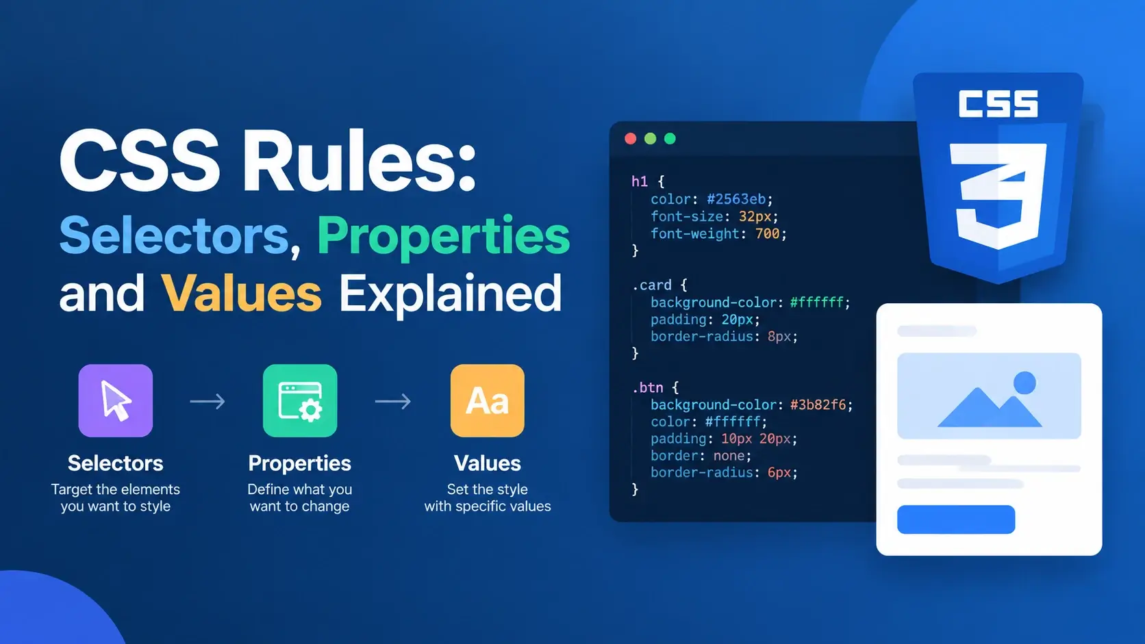
Every stylesheet you have ever seen is made from one repeating structure: a rule. A rule says which elements to style, what to change about them, and what to set it to. That is the whole idea, and once it clicks, CSS stops looking like a wall of punctuation.
But the three parts of a rule behave very differently from each other. Selectors are a pattern-matching language with its own rules. Properties are a fixed vocabulary you cannot invent words for. Values come in a dozen types, and each property accepts only certain ones.
This guide takes each part in turn: what it is, how it is written, how the pieces combine, and — most importantly — the mistakes that make a rule do nothing at all while the browser stays completely silent about it.
What Is a CSS Rule?
A CSS rule is a single instruction. It names a target, then lists the changes to make to that target. Here is one:
.card {
    padding: 24px;
    border-radius: 12px;
    background: #ffffff;
}
Read it as a sentence: “For every element with the class card, set the padding to 24 pixels, the border radius to 12 pixels, and the background to white.”
That is one rule containing three declarations. A stylesheet is just a long list of rules like this one, each targeting a different set of elements and applying a different set of changes.
Rule, declaration, and declaration block
Three terms get used loosely, so it is worth separating them precisely:
- A declaration block is everything between the curly braces — the container.
- A declaration is one property and value pair inside that block, such as
padding: 24px;. - A rule is the whole thing: the selector plus the declaration block.
So in the example above, there is one rule, one declaration block, and three declarations. When people say “the padding rule,” they usually mean the declaration; when they say “the card rule,” they mean the whole rule.
CSS is parsed in order. If two rules set the same property on the same element, the one that comes later in the stylesheet wins — unless the earlier one has higher specificity. Order is not decoration; it is part of how the language works.
The Three Parts of a Rule
Strip away the punctuation and every CSS rule is made of exactly three things. Everything else — braces, colons, semicolons — is just glue holding them together.
class="card".
The property and value together — separated by a colon and ended with a semicolon — form a declaration. The declaration block is simply a list of declarations wrapped in braces.
Writing padding 24px; produces a declaration the browser cannot parse. It
drops it silently, with no console error and no visual warning, and the padding simply
never appears.
Part 1 — Selectors: Choosing Elements
The selector is the part of the rule that decides which elements get styled. It is a pattern the browser matches against your HTML, and it is where most of the expressive power of CSS lives.
Element selectors
The simplest selector is a tag name. It matches every element of that type:
<!DOCTYPE html>
<html lang="en">
<head>
    <meta charset="UTF-8">
    <title>Element Selectors</title>
    <style>
        body { font-family: system-ui, sans-serif; padding: 24px; background: #f8fafc; }
        h1 { color: #0891b2; margin: 0 0 12px; }
        p  { color: #475569; line-height: 1.7; }
    </style>
</head>
<body>
    <h1>Element selectors</h1>
    <p>Every paragraph is matched by the same rule.</p>
    <p>No classes or IDs involved at all.</p>
</body>
</html>
Class selectors
A class selector begins with a dot and matches every element carrying that class. It is the most useful selector in CSS because it is reusable:
<!DOCTYPE html>
<html lang="en">
<head>
    <meta charset="UTF-8">
    <title>Class Selectors</title>
    <style>
        body { font-family: system-ui, sans-serif; padding: 24px; background: #f8fafc; }
        .tag {
            display: inline-block;
            background: rgba(8, 145, 178, 0.12);
            color: #0891b2;
            font-size: 0.78rem;
            font-weight: 700;
            letter-spacing: 0.06em;
            text-transform: uppercase;
            padding: 5px 12px;
            border-radius: 999px;
            margin-right: 6px;
        }
    </style>
</head>
<body>
    <span class="tag">CSS</span>
    <span class="tag">Rules</span>
    <span class="tag">Classes</span>
</body>
</html>
An element can carry several classes at once, separated by spaces. Each one brings its own rule into play:
<button class="btn btn--primary btn--large">Save</button>ID selectors
An ID selector begins with a hash and matches the single element with that
id attribute. IDs must be unique in a document:
<!DOCTYPE html>
<html lang="en">
<head>
    <meta charset="UTF-8">
    <title>ID Selectors</title>
    <style>
        body { font-family: system-ui, sans-serif; padding: 24px; background: #f8fafc; }
        #site-title {
            color: #7c3aed;
            border-bottom: 3px solid #7c3aed;
            padding-bottom: 8px;
            display: inline-block;
        }
    </style>
</head>
<body>
    <h1 id="site-title">Styled by an ID</h1>
</body>
</html>
Because an ID can only appear once, an ID rule can only ever style one element. That makes it a poor fit for styling — and because ID selectors outrank every class selector, they are also hard to override later.
Attribute selectors
Attribute selectors match elements based on their attributes, which is handy for styling form controls and links without adding classes:
<!DOCTYPE html>
<html lang="en">
<head>
    <meta charset="UTF-8">
    <title>Attribute Selectors</title>
    <style>
        body { font-family: system-ui, sans-serif; padding: 24px; background: #f8fafc; }
        input {
            padding: 9px 13px;
            border: 1px solid #cbd5e1;
            border-radius: 8px;
            font: inherit;
            margin: 4px 4px 4px 0;
        }
        input[type="email"] {
            border-color: #0891b2;
            background: #f0fdff;
        }
        a[href^="https"]::after {
            content: " ↗";
            color: #7c3aed;
        }
    </style>
</head>
<body>
    <input type="text" placeholder="Ordinary text input">
    <input type="email" placeholder="Email input">
    <p><a href="https://example.com">An external link</a></p>
</body>
</html>| Operator | Example | Matches |
|---|---|---|
= |
[type="email"] |
Exactly that value |
^= |
[href^="https"] |
Starts with |
$= |
[href$=".pdf"] |
Ends with |
*= |
[class*="btn"] |
Contains |
~= |
[class~="card"] |
One of the space-separated words |
Reach for a class selector by default. Element selectors are for base styling, attribute selectors for form controls and link types, and IDs for anchors and JavaScript hooks — not for styling.
Combining Selectors
Selectors become far more precise when you combine them. CSS gives you four combinators that describe the relationship between two elements.
nav a— descendant. Any link inside a nav, at any depth.nav > a— child. Only links that are direct children of a nav.h2 + p— adjacent sibling. A paragraph immediately after a heading.h2 ~ p— general sibling. Any paragraph following a heading in the same parent.
<!DOCTYPE html>
<html lang="en">
<head>
    <meta charset="UTF-8">
    <title>Combinators</title>
    <style>
        body { font-family: system-ui, sans-serif; padding: 24px; background: #f8fafc; }
        .menu a {
            display: block;
            padding: 8px 12px;
            color: #0891b2;
            text-decoration: none;
            border-radius: 8px;
        }
        .menu > a {
            font-weight: 700;
            background: rgba(8, 145, 178, 0.08);
            margin-bottom: 4px;
        }
    </style>
</head>
<body>
    <nav class="menu">
        <a href="#">Direct child — bold and tinted</a>
        <div>
            <a href="#">Nested link — plain</a>
        </div>
    </nav>
</body>
</html>
Both links match .menu a, but only the first matches
.menu > a, because the second sits inside a <div> rather
than being a direct child of the menu.
Grouping selectors
When several selectors should share the same declarations, separate them with commas. Each selector is matched independently, so the rule applies to the union of all of them:
/* Repetitive */
h1 { margin-bottom: 16px; }
h2 { margin-bottom: 16px; }
h3 { margin-bottom: 16px; }

/* Grouped — identical result */
h1,
h2,
h3 {
    margin-bottom: 16px;
}
h1 h2 h3 is not a list of three headings. It is a descendant selector
meaning “an h3 inside an h2 inside an h1” — which
matches nothing in a valid document, and reports no error at all.
Pseudo-classes and Pseudo-elements
Two selector families target things the markup cannot express directly. They are distinguished by colon count, and mixing them up is a common source of confusion.
Pseudo-classes — a state
A pseudo-class uses a single colon and matches an element in a particular state. The element exists in the HTML; the pseudo-class describes a condition.
a:hover         { color: #7c3aed; }    /* pointer is over it */
a:focus-visible { outline: 2px solid; } /* keyboard focus */
a:visited       { color: #64748b; }    /* already visited */
input:disabled  { opacity: 0.5; }      /* disabled form field */
li:first-child  { font-weight: 700; }  /* first item in a list */
p:nth-child(2)  { margin-top: 0; }     /* the second child */
The :nth-child() family is worth knowing because it builds patterns without
extra classes:
li:nth-child(odd)  { background: #f8fafc; }  /* zebra striping */
li:nth-child(3n)   { color: #0891b2; }       /* every third item */
li:not(.featured)  { opacity: 0.7; }         /* everything except */
Pseudo-elements — a part of an element
A pseudo-element uses a double colon and styles a specific portion of an element, or generates an entirely new one:
<!DOCTYPE html>
<html lang="en">
<head>
    <meta charset="UTF-8">
    <title>Pseudo-elements</title>
    <style>
        body { font-family: system-ui, sans-serif; padding: 24px; background: #f8fafc; }
        .quote {
            position: relative;
            padding-left: 22px;
            color: #475569;
            font-style: italic;
            line-height: 1.7;
        }
        .quote::before {
            content: "";
            position: absolute;
            left: 0;
            top: 4px;
            bottom: 4px;
            width: 4px;
            border-radius: 4px;
            background: linear-gradient(180deg, #06b6d4, #7c3aed);
        }
        .quote::first-line {
            font-weight: 700;
            color: #0f172a;
        }
    </style>
</head>
<body>
    <p class="quote">
        Pseudo-elements style parts of an element that are not in the
        markup — a first line, a first letter, or a new box created by
        the content property.
    </p>
</body>
</html>
The ::before pseudo-element here does not exist in the HTML at all. It is
generated by CSS and used as a decorative accent bar — one of the most common techniques in
modern stylesheets.
| Syntax | Type | Targets |
|---|---|---|
:hover |
Pseudo-class | A state the element is in |
:first-child |
Pseudo-class | A position among siblings |
::before |
Pseudo-element | A generated box before the content |
::first-line |
Pseudo-element | A part of the element’s text |
Older pseudo-elements such as :before and :after still work
with a single colon for backwards compatibility. The double colon is the modern form and
makes the distinction obvious at a glance.
Part 2 — Properties: What You Can Change
The property is the middle part of a declaration. It names the aspect of the element you want to change, and it must be one of the keywords defined in the CSS specification.
There are several hundred properties, and they group naturally into a handful of families:
Color & background
color, background-color, background-image, opacity
Typography
font-family, font-size, font-weight, line-height, letter-spacing
Spacing & sizing
margin, padding, width, height, gap
Borders & effects
border, border-radius, box-shadow, filter
Layout
display, position, flex, grid-template-columns
Motion
transition, animation, transform, scroll-behavior
Properties are a fixed vocabulary
You cannot invent a property. colour, text-size, and
fontsize are not CSS properties, and a declaration using them is discarded
without any warning:
/* Valid — these are real properties */
color: red;
font-size: 1rem;
padding: 24px;
display: flex;

/* Invalid — no such properties, silently dropped */
colour: red;
text-size: 1rem;
fontsize: 16px;
This is why a typo in a property name is so frustrating. The declaration is not rejected with an error — it is quietly skipped, and the styling simply never happens.
Some properties are inherited, some are not
Inheritance determines whether an element picks up a property value from its parent.
Setting an inherited property on body affects the whole page; setting a
non-inherited one affects only the body box itself.
| Property | Inherits? | Effect of setting it on body |
|---|---|---|
color |
Yes | Every descendant inherits the text color |
font-family |
Yes | The whole page uses that font |
line-height |
Yes | All text inherits the line spacing |
margin |
No | Only the body box gets the margin |
padding |
No | Only the body box gets the padding |
border |
No | Only the body box gets a border |
Buttons, inputs, and textareas use the browser’s default font unless you tell them
otherwise. font-family: inherit; and font: inherit; are two of
the most frequently written lines in any stylesheet.
Shorthand vs Longhand Properties
Many properties come in two forms. The longhand sets one specific value; the shorthand sets several related longhands in a single declaration.
/* Longhand — four separate declarations */
margin-top: 8px;
margin-right: 16px;
margin-bottom: 8px;
margin-left: 16px;

/* Shorthand — one declaration, clockwise from the top */
margin: 8px 16px 8px 16px;

/* Shorthand — vertical then horizontal */
margin: 8px 16px;

/* Shorthand — all four sides */
margin: 8px;
The values read clockwise starting from the top: top, right, bottom, left. Two values mean vertical then horizontal; three mean top, horizontal, bottom.
This is the trap that catches everyone once. background: red; does not just
set the background color — it resets background-image,
background-position, background-size, and every other
background longhand to its default. If you only want to change one aspect, use the
longhand.
| Shorthand | Longhands it sets |
|---|---|
margin |
margin-top, margin-right, margin-bottom, margin-left |
padding |
padding-top, padding-right, padding-bottom, padding-left |
border |
border-width, border-style, border-color |
font |
font-style, font-variant, font-weight, font-size, line-height, font-family |
background |
background-color, background-image, background-position, background-size, and more |
flex |
flex-grow, flex-shrink, flex-basis |
The rule of thumb: use a shorthand when you want to set the whole group, and a longhand when you want to change just one part without disturbing the rest.
Part 3 — Values: What You Can Set
The value is the last part of a declaration. It says what to set the property to, and the kinds of values a property accepts are defined by the specification.
Keywords
Many properties accept a fixed set of named keywords. These are not quoted and not capitalized:
display: flex;
position: absolute;
text-align: center;
overflow: hidden;
font-weight: bold;
cursor: pointer;
Lengths and units
| Unit | Relative to | Typical use |
|---|---|---|
px |
Nothing — a fixed pixel | Borders, shadows, small fixed details |
rem |
The root font size | Font sizes, spacing, anything that should scale |
em |
The element’s own font size | Padding that scales with the text |
% |
The parent’s size | Widths, heights, fluid layouts |
ch |
The width of the “0” character | Line-length limits on paragraphs |
vw / vh |
The viewport width or height | Full-screen sections, fluid type |
Colors
color: #0891b2;                  /* hex */
color: rgb(8 145 178);           /* red, green, blue */
color: hsl(192 92% 36%);         /* hue, saturation, lightness */
color: rgba(8, 145, 178, 0.5);   /* with transparency */
color: rebeccapurple;            /* named color */
Numbers, strings, and URLs
opacity: 0.8;                    /* a plain number */
line-height: 1.7;                /* a unitless number */
z-index: 10;                     /* an integer */
font-family: "Space Grotesk";    /* a quoted string */
background-image: url("hero.jpg"); /* a URL */
Lists of values
Some properties accept several values at once, and some accept comma-separated lists:
/* Space-separated — one value per axis */
background-position: center top;

/* Comma-separated — layered shadows, first on top */
box-shadow:
    0 1px 2px rgba(15, 23, 42, 0.05),
    0 24px 48px -20px rgba(15, 23, 42, 0.2);

/* Comma-separated — a font stack as fallbacks */
font-family: 'Inter', system-ui, -apple-system, sans-serif;
The last entry in font-family should be a generic like
sans-serif or monospace. If none of the named fonts are
installed, the browser then falls back to something in the right category rather than
picking arbitrarily.
Global keywords
Every property also accepts three special keywords, which are useful for resetting or forcing inheritance:
inherit— take the computed value from the parent.initial— reset to the property’s default value.unset— inherit if the property is inheritable, otherwise reset.
button {
    font: inherit;      /* use the surrounding typography */
}

.reset {
    all: unset;         /* strip every declaration on this element */
}
Values That Compute: Functions
Many properties accept function values, which calculate a result at render time rather than using a fixed literal. They look like a name followed by parentheses.
/* Fluid type that never gets too small or too large */
font-size: clamp(1.5rem, 4vw, 3rem);

/* Responsive grid that wraps automatically */
grid-template-columns: repeat(auto-fit, minmax(220px, 1fr));

/* Transform an element */
transform: rotate(45deg) scale(1.1);

/* Semi-transparent brand color */
background: rgb(8 145 178 / 0.15);

/* Read a custom property, with a fallback */
color: var(--brand, #0891b2);
clamp() is worth learning early. It takes a minimum, a preferred value, and a
maximum, which lets a single declaration replace several media queries.
Custom properties — values you define yourself
Custom properties begin with two dashes, and unlike built-in properties, their names are
entirely up to you. They are read back with var():
<!DOCTYPE html>
<html lang="en">
<head>
    <meta charset="UTF-8">
    <title>Custom Properties</title>
    <style>
        :root {
            --brand: #0891b2;
            --radius: 12px;
            --space: 18px;
        }
        body { font-family: system-ui, sans-serif; padding: 24px; background: #f8fafc; }
        .panel {
            background: var(--brand);
            color: #fff;
            border-radius: var(--radius);
            padding: var(--space);
            font-weight: 600;
        }
    </style>
</head>
<body>
    <div class="panel">Styled with custom properties</div>
</body>
</html>
Change --brand once and every rule referencing it updates. That is the
mechanism behind design tokens and dark mode.
Almost everything in CSS is case-insensitive, but --Brand and
--brand are two different custom properties. Pick a lowercase, dashed
convention and stay with it.
Rule Sets and At-Rules
Almost everything in a stylesheet is a rule set — a selector followed by a
declaration block. But CSS has a second kind of statement: the at-rule,
which starts with an @ symbol and gives an instruction rather than styling an
element directly.
Selector + block
Styles a specific set of elements. Almost every rule you write is one of these.
.card { padding: 24px; }
@ + instruction
Controls how other rules are loaded, applied, or grouped. It does not match elements itself.
@media (min-width: 600px) { ... }
@media — conditional rules
Applies a block of rules only when a condition is met. This is the foundation of responsive design:
<!DOCTYPE html>
<html lang="en">
<head>
    <meta charset="UTF-8">
    <meta name="viewport" content="width=device-width, initial-scale=1">
    <title>@media</title>
    <style>
        body { font-family: system-ui, sans-serif; padding: 24px; margin: 0; background: #f8fafc; }
        .banner {
            background: #0f172a;
            color: #fff;
            padding: 20px;
            border-radius: 12px;
            text-align: center;
        }
        @media (min-width: 460px) {
            .banner {
                background: #0891b2;
                padding: 36px;
                font-size: 1.15rem;
            }
        }
    </style>
</head>
<body>
    <div class="banner">Resize the preview — this changes at 460px wide.</div>
</body>
</html>
@keyframes — defining an animation
@keyframes pulse {
    0%, 100% { transform: scale(1);    opacity: 1; }
    50%      { transform: scale(1.08); opacity: 0.7; }
}

.dot {
    animation: pulse 2s ease-in-out infinite;
}
@supports — feature detection
@supports (backdrop-filter: blur(10px)) {
    .card {
        backdrop-filter: blur(10px);
        background: rgba(255, 255, 255, 0.7);
    }
}
@import and @font-face
@import url("typography.css");

@font-face {
    font-family: "My Font";
    src: url("my-font.woff2") format("woff2");
    font-display: swap;
}
@import must appear at the very top of the stylesheet, before any rule sets. In
practice a <link> element in the HTML is usually preferred, because
imports can delay loading.
Inside a @media or @supports block, you write ordinary rules
exactly as you would anywhere else. The at-rule is just a wrapper that decides whether
those rules apply.
How Rules Are Applied to an Element
Once you have written several rules, the browser has to work out which ones actually affect a given element — and what to do when two rules disagree. This is the cascade, and it is worth understanding at a high level because your selector choices are what drive it.
When two rules set the same property on the same element, the winner is decided in this order:
- Importance —
!importantdeclarations beat normal ones. - Specificity — the selector with the higher weight wins.
- Source order — if everything else is equal, the later rule wins.
| Selector type | Example | Weight |
|---|---|---|
| Universal | * |
0,0,0,0 |
| Element | h1, p |
0,0,0,1 |
| Class, attribute, pseudo-class | .card, [type="text"], :hover |
0,0,1,0 |
| ID | #header |
0,1,0,0 |
| Inline style | style="color: red" |
1,0,0,0 |
So #header .nav a beats .nav a, which beats a — no
matter what order they appear in. This is why writing nav ul li a when
.menu-link would do creates problems later, even though both produce the same
result today.
Aim for a single class selector wherever you can. Low-specificity rules are easy to override, easy to read, and predictable as a stylesheet grows.
Common Mistakes with CSS Rules
CSS does not report errors. Every mistake below produces a rule that simply does nothing, with no console message and no visual warning. These are the ones that come up most.
1. A missing semicolon
.card {
    padding: 24px
    border-radius: 12px;
}.card {
padding: 24px;
border-radius: 12px;
}
Without the semicolon, the browser reads 24px border-radius: 12px as one
invalid value and discards both declarations. The element gets neither style.
2. A missing colon
.card {
    padding 24px;
    color red;
}.card {
padding: 24px;
color: red;
}3. A misspelled property
.card {
    colour: red;
    font-weigth: 700;
    boarder-radius: 12px;
}.card {
color: red;
font-weight: 700;
border-radius: 12px;
}4. Forgetting the dot on a class selector
<div class="card">...</div>

card {
    padding: 24px;
}<div class="card">...</div>
.card {
padding: 24px;
}5. A class name that does not match the HTML
<div class="card__title">Hello</div>

.card-title {
    color: #0891b2;
}<div class="card__title">Hello</div>
.card__title {
color: #0891b2;
}6. An invalid value for the property
.card {
    font-size: red;
    display: 24px;
}.card {
font-size: 16px;
display: block;
}7. A missing unit
.card {
    padding: 24;
    width: 300;
    margin-top: 0;
}.card {
padding: 24px;
width: 300px;
margin-top: 0; /* zero needs no unit */
}
Zero is the one exception: 0 is valid without a unit, though writing
0px is also allowed and sometimes clearer.
8. Forgetting the comma in a grouped selector
h1 h2 h3 {
    margin-bottom: 16px;
}h1,
h2,
h3 {
margin-bottom: 16px;
}9. An unclosed declaration block
.card {
    padding: 24px;

.other {
    margin: 12px;
}.card {
padding: 24px;
}
.other {
margin: 12px;
}A missing closing brace swallows every rule after it. This is why a stylesheet sometimes appears to break halfway down the file — everything above the mistake works, and everything below does nothing.
The W3C CSS Validation Service catches typos, unbalanced braces, unknown properties, and invalid values. It is the fastest way to find the silent errors the browser never reports.
Best Practices for Writing Rules
These habits keep a stylesheet readable and predictable as it grows from a few rules to a few thousand.
One declaration per line
Easier to scan, easier to diff, and much easier to spot a missing semicolon.
Always end with a semicolon
Even on the last declaration. It prevents errors when you add another one later.
Name classes by purpose
.alert survives a redesign; .red-box does not.
Prefer classes for styling
Reserve IDs for anchors and JavaScript hooks, where uniqueness is the point.
Keep specificity low
One class is almost always enough. Long descendant chains are hard to override.
Set box-sizing globally
* { box-sizing: border-box; } removes an entire class of sizing bugs.
Prefer relative units
rem, em, and ch respect user font settings.
Use custom properties
Define brand colors and spacing once, then reference them in every rule.
Group and comment
Organize rules by component and add a short comment above each section.
Short selectors, clear property names, values with units, and a semicolon on every declaration. Everything else is detail.
Frequently Asked Questions
1. What is a CSS rule?
A CSS rule is a single instruction in a stylesheet. It consists of a selector that chooses which elements to style, followed by a declaration block in curly braces containing one or more property and value pairs.
2. What are the three parts of a CSS rule?
The selector, which targets elements; the property, which names what to change; and the value, which says what to set it to. The property and value together form a declaration, and the declarations sit inside a declaration block.
3. What is the difference between a rule and a declaration?
A rule is the whole statement — selector plus declaration block. A declaration is a
single property and value pair inside that block, such as color: red;.
One rule can contain many declarations.
4. What is a selector in a CSS rule?
The selector is the part before the curly braces that decides which elements the rule applies to. It can be an element name, a class, an ID, an attribute, a pseudo-class, or a combination of these.
5. Can a CSS rule have more than one selector?
Yes. Grouping several selectors with commas makes one rule apply to all of them, such
as h1, h2, h3 { margin-bottom: 16px; }. Each selector in the group is
matched independently.
6. Can a CSS rule have more than one property?
Yes, and most do. A declaration block can contain as many declarations as you like, each ending with a semicolon. There is no practical limit, though keeping rules focused is easier to maintain.
7. What happens if a property name is misspelled?
The browser does not recognize the property and silently discards that declaration. There is no error message, so the styling simply does not appear. This is one of the most common causes of CSS that appears not to work.
8. What is a shorthand property?
A shorthand property sets several related longhand properties in one declaration. For
example, margin: 8px 16px sets all four margin sides at once. Shorthands
are concise but reset any longhand you do not mention.
9. What kinds of values can CSS properties take?
Values include keywords such as flex or block, lengths such
as 16px and 1rem, percentages, colors, numbers, strings,
URLs, and functions such as clamp() or rgb(). Each property
accepts only certain kinds of values.
10. What is an at-rule and how is it different from a normal rule?
An at-rule begins with an @ symbol and gives an instruction rather than
styling an element directly. Examples include @media,
@import, @keyframes, and @supports. Normal rules
always start with a selector.
11. Do CSS rules need a semicolon after the last declaration?
Technically the final semicolon in a block is optional, but you should always include it. Omitting it causes problems the moment another declaration is added after it.
12. Which CSS rule wins when two rules match the same element?
The browser resolves conflicts by importance first, then specificity, then source order. If everything else is equal, the rule that appears later in the stylesheet wins.
Key Takeaways
- A CSS rule is a selector plus a declaration block inside curly braces.
- A declaration is a property and value pair:
property: value;. - Selectors decide which elements are styled; properties and values decide how.
- Classes are the most useful selector; IDs are unique and poor for styling.
- Combinators describe relationships: descendant, child, and sibling.
- Pseudo-classes use one colon for states; pseudo-elements use two for parts.
- Property names are a fixed vocabulary — a typo is silently ignored.
- Shorthand properties are concise but reset any longhand they cover.
- Values come in many types, and each property accepts only certain ones.
- At-rules start with
@and wrap other rules with a condition. - When rules conflict, importance, specificity, and source order decide the winner.
- CSS fails silently — a missing semicolon or brace breaks rules with no warning.
What to Learn Next
Now that the structure of a rule is clear, the next step is to go deeper on each part. Start with CSS Selectors Explained and CSS Syntax Explained.
From there, explore The CSS Box Model, CSS Colors and Backgrounds, and CSS Units: px, em, and rem. When you are ready to build layouts, read CSS Flexbox Guide and CSS Grid Guide, then move on to Responsive Web Design and CSS Custom Properties.
If you are still getting oriented, read What Is CSS? and What Is CSS Used For? for the surrounding context.
Practice Challenge
The fastest way to understand rules is to write several by hand and break them deliberately. This exercise takes about fifteen minutes.
- Create
index.htmlandstyles.cssin the same folder, and link them with<link rel="stylesheet" href="styles.css">. - In the HTML, build a card with a heading carrying
class="card__title", a paragraph, and a link carryingclass="card__link". - Write an element selector rule for
bodysetting a font, a background, and padding. - Write a class selector rule for
.cardwith padding, a border radius, and a background. - Write a descendant selector rule for
.card .card__titleand give it a color. - Add a pseudo-class rule for
.card__link:hover. - Add a pseudo-element rule using
.card__title::beforewithcontent: "▸ ". - Group two selectors in one rule using commas, and confirm both elements are styled.
- Add a
@media (min-width: 600px)at-rule that increases the card’s padding. - Now break it on purpose: delete a semicolon and refresh. Note what disappears. Put it back.
- Delete a closing brace and refresh. Note how every rule after it stops working. Put it back.
- Open DevTools, inspect the card, and check which rules are applied and which are overridden.
If you complete those steps, you have written rules using element, class, descendant, pseudo-class, and pseudo-element selectors, grouped selectors, and an at-rule — and you have seen for yourself exactly how CSS fails when a rule is malformed. That last part is what turns a confusing stylesheet into a solvable one, because from then on you know that a rule doing nothing is almost always a rule the browser could not read.

 Inar Learn