
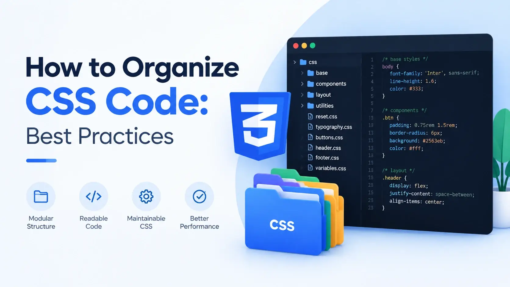
Every stylesheet starts clean. The first hundred lines are readable, the structure makes
sense, and finding a rule takes seconds. Then the project grows. Someone adds a page, then
a component, then a redesign. A year later the file is three thousand lines long, half the
rules are duplicated, and nobody can remember why margin-top is set three
different times on the same element.
This is not a discipline problem. It is a structure problem. CSS gives you no scoping, no modules, and no enforcement — so without a deliberate organization scheme, entropy wins by default.
This guide covers the organization that actually works at scale: the layered mental model, file structure options, the order rules should appear in, design tokens, the utility layer, where responsive and print styles belong, and a full before-and-after refactor.
Why CSS Organization Matters
Most languages give you tools that enforce organization. A module system keeps names scoped, a compiler catches unused code, and a linter flags duplicate logic. CSS has none of that. A stylesheet is a single flat list of rules applied globally, and nothing stops you from writing the same declaration in five different places.
That absence has four consequences, and every one of them shows up in a disorganized project.
Unpredictable overrides
When rules are scattered, the one that wins depends on specificity and source order. Nobody can predict the result without opening DevTools and inspecting.
Duplication
Without a clear home for a value, the same color or spacing gets redefined in every component. A rebrand becomes a find-and-replace across hundreds of rules.
Dead code accumulation
Rules for deleted components stay in the file because nobody can prove they are unused. The stylesheet grows while the site shrinks.
Slow debugging
When something looks wrong, the fix should take two minutes. In a disorganized stylesheet it takes an hour, because the first problem is finding the rule at all.
Hand the stylesheet to someone who has never seen the project and ask them to change the border radius on every card. In a well-organized file, that is one edit in one place. In a disorganized one, it is a search across the whole file with no guarantee of finding every instance.
The Layered Mental Model
The most useful way to think about CSS organization is as a stack of layers, ordered from the broadest reach to the narrowest. Each layer is more specific than the one before it, so a rule in a lower layer naturally overrides a rule in a higher one.
This is the core idea behind ITCSS — Inverted Triangle CSS — and it is the single most useful structural concept in CSS.
<h1> or <p> looks like with no class.
.u-hidden, .u-text-center. Usually !important.
The shape matters more than the exact names. Each layer is more specific than the last, so
the cascade resolves naturally without anyone needing !important to force an
override.
Why this order works
Consider what happens when a utility tries to hide a component that has its own
display rule.
/* Written in the wrong order — the component wins */

/* Utilities first */
.u-hidden {
    display: none;
}

/* Components later */
.card {
    display: flex;
}

/* Result: adding class="card u-hidden" does nothing.
   The .card rule comes later, so display: flex wins. */
Now reverse the order, and the utility wins as intended — with no !important
needed at all.
/* Correct order — the utility wins */

/* Components first */
.card {
    display: flex;
}

/* Utilities last */
.u-hidden {
    display: none;
}

/* Result: class="card u-hidden" is hidden, as expected. */When two rules have the same specificity, the later one wins. That is not a quirk to work around — it is the mechanism that makes layered organization possible. Order your layers deliberately and the cascade does the work for you.
File Structure Options
The layered model applies whether you write one file or fifty. What changes is how you split them up.
Option 1: A single stylesheet
One file, organized internally with section headers in layer order. This is the right choice for small sites and for anyone learning.
/* ==========================================================================
   styles.css
   --------------------------------------------------------------------------
   Table of contents
   1. Settings .......... design tokens
   2. Base .............. reset and element defaults
   3. Layout ............ containers and grids
   4. Components ........ cards, buttons, nav
   5. Utilities ......... single-purpose overrides
   ========================================================================== */

/* ==========================================================================
   1. SETTINGS
   ========================================================================== */

:root {
    --color-brand: #0891b2;
    --color-text: #0f172a;
    --space-3: 16px;
    --radius-md: 12px;
}

/* ==========================================================================
   2. BASE
   ========================================================================== */

*,
*::before,
*::after {
    box-sizing: border-box;
}

body {
    font-family: system-ui, sans-serif;
    color: var(--color-text);
    line-height: 1.7;
    margin: 0;
}

/* ==========================================================================
   3. LAYOUT
   ========================================================================== */

.l-container {
    max-width: 1100px;
    margin: 0 auto;
    padding: 0 var(--space-3);
}

/* ==========================================================================
   4. COMPONENTS
   ========================================================================== */

.card { }
.card__title { }

/* ==========================================================================
   5. UTILITIES
   ========================================================================== */

.u-hidden {
    display: none !important;
}
Even in a single file, the layer order and the section headers do all the work. A developer opening this file knows immediately where to look for a component and where to add a new utility.
Option 2: Split by layer
The same structure, split into files. Numbered prefixes keep them in the correct order both on disk and in the browser.
Linked in order from the HTML, the cascade behaves exactly as it did in the single file:
<head>
    <link rel="stylesheet" href="css/01-settings.css">
    <link rel="stylesheet" href="css/02-base.css">
    <link rel="stylesheet" href="css/03-layout.css">
    <link rel="stylesheet" href="css/04-components.css">
    <link rel="stylesheet" href="css/05-utilities.css">
    <link rel="stylesheet" href="css/06-print.css" media="print">
</head>
Option 3: Split by component
On a larger project, the components layer itself splits into one file per component. This is where a design system lives.
Each component file is small and self-contained, which makes it easy to find, edit, and eventually delete. In production a build step concatenates them back into a single stylesheet, so the browser still makes one request.
| Structure | Best for | Trade-off |
|---|---|---|
| Single file | Small sites, landing pages, learning | Gets unwieldy past a few hundred rules |
| Split by layer | Most projects — a clear structure without many files | The components file becomes the new bottleneck |
| Split by component | Design systems, large teams, many reusable pieces | Needs a build step to combine files for production |
Chaining @import rules inside a stylesheet forces serial downloads — the
browser cannot discover the imported file until it has parsed the parent. Use separate
<link> elements during development, or a build step that concatenates
the files for production.
Ordering Rules Within a File
Whichever structure you choose, the rules inside each file follow the same principle: generic to specific. A developer scanning top to bottom should encounter increasingly narrow rules.
Ordering within a component
Inside a single component, use a consistent property order so every rule reads the same way. A widely used convention groups properties by what they affect:
.card {
    /* 1. Positioning */
    position: relative;
    top: 0;
    z-index: 1;

    /* 2. Display and layout */
    display: flex;
    flex-direction: column;
    gap: 12px;

    /* 3. Box model */
    width: 100%;
    max-width: 340px;
    padding: 22px;
    margin-bottom: 16px;

    /* 4. Borders and background */
    border: 1px solid #e2e8f0;
    border-radius: 14px;
    background: #fff;

    /* 5. Typography */
    font-size: 0.95rem;
    line-height: 1.65;
    color: #334155;

    /* 6. Visual effects */
    box-shadow: 0 12px 28px -22px rgba(15, 23, 42, 0.4);
    opacity: 1;

    /* 7. Motion */
    transition: transform 0.2s ease, box-shadow 0.2s ease;
}
The exact groups matter less than the consistency. Once every rule follows the same sequence, you can find a property without reading the whole block.
Ordering within a layer
Inside the components layer, order components by how widely they are used. Global pieces first, page-specific pieces last.
- Global components — buttons, forms, cards. Used everywhere.
- Shared components — navigation, footer, modal. Used on most pages.
- Page-specific components — hero, pricing table, testimonial. Used once.
This ordering means a page-specific override naturally comes after the shared component it modifies, so the cascade resolves in your favour without any extra effort.
When a group has many items with no natural order — utility classes, for instance — alphabetical sorting makes them easy to scan. It is not required, but it is a cheap way to make a long list predictable.
Design Tokens with Custom Properties
The settings layer is where organization pays off the most. Every repeated value in a stylesheet — a brand color, a spacing step, a border radius — should exist exactly once, as a custom property.
:root {
    /* ---------------------------------------------------------------
       Colors
       --------------------------------------------------------------- */
    --color-brand: #0891b2;
    --color-brand-dark: #0e7490;
    --color-text: #0f172a;
    --color-text-muted: #64748b;
    --color-surface: #ffffff;
    --color-surface-alt: #f8fafc;
    --color-border: #e2e8f0;
    --color-danger: #e11d48;

    /* ---------------------------------------------------------------
       Spacing — an 8px scale
       --------------------------------------------------------------- */
    --space-1: 4px;
    --space-2: 8px;
    --space-3: 16px;
    --space-4: 24px;
    --space-5: 32px;
    --space-6: 48px;

    /* ---------------------------------------------------------------
       Radius
       --------------------------------------------------------------- */
    --radius-sm: 6px;
    --radius-md: 12px;
    --radius-lg: 20px;
    --radius-full: 999px;

    /* ---------------------------------------------------------------
       Typography
       --------------------------------------------------------------- */
    --font-body: 'Inter', system-ui, sans-serif;
    --font-display: 'Space Grotesk', sans-serif;
    --text-sm: 0.875rem;
    --text-base: 1rem;
    --text-lg: 1.25rem;
    --text-xl: 2rem;

    /* ---------------------------------------------------------------
       Effects
       --------------------------------------------------------------- */
    --shadow-sm: 0 1px 2px rgba(15, 23, 42, 0.05);
    --shadow-md: 0 12px 28px -22px rgba(15, 23, 42, 0.4);

    /* ---------------------------------------------------------------
       Motion
       --------------------------------------------------------------- */
    --ease: cubic-bezier(0.2, 0.7, 0.3, 1);
    --duration-fast: 0.2s;
    --duration-slow: 0.35s;
}
Every component then references these tokens instead of hard-coded values.
.card {
    padding: var(--space-4);
    border: 1px solid var(--color-border);
    border-radius: var(--radius-md);
    background: var(--color-surface);
    box-shadow: var(--shadow-md);
    transition: transform var(--duration-fast) var(--ease);
}

.card__title {
    margin: 0 0 var(--space-2);
    font-family: var(--font-display);
    font-size: var(--text-lg);
    color: var(--color-text);
}

.card__text {
    margin: 0;
    font-size: var(--text-sm);
    color: var(--color-text-muted);
    line-height: 1.65;
}
Now the entire visual identity of the site lives in one block at the top of one file. A rebrand is a handful of edits, not a find-and-replace.
Theming becomes trivial
Because components reference tokens rather than values, a theme is just a different set of token values applied under a different condition. No component rule has to change.
@media (prefers-color-scheme: dark) {
    :root {
        --color-text: #e2e8f0;
        --color-text-muted: #94a3b8;
        --color-surface: #0f172a;
        --color-surface-alt: #1e293b;
        --color-border: #334155;
    }
}

/* Every component that uses these tokens is now dark-mode ready.
Not one component rule was touched. */Everything else in this guide is about where rules go. Tokens are about where values go, and they eliminate more duplication than any other single change.
The Components Layer
The components layer is where most of the CSS lives, so it is worth organizing carefully. Two rules keep it manageable: group by component, and keep everything about a component together.
Group by component, not by page
By page
Duplicates everythingThe same card appears on the home page, the blog, and the pricing page. It gets styled three times, with slight differences nobody intended.
Fixing a bug means finding and fixing it three times.
By component
Defined onceThe card is styled once. Every page that uses it gets the same result automatically.
Fixing a bug means fixing it in one place.
Keep a component’s rules together
Everything about a component belongs in one contiguous block: the block, its elements, its modifiers, and its responsive rules. Never scatter them across the file.
/* ==========================================================================
   COMPONENT: Card
   ========================================================================== */

/* Block */
.card {
    padding: var(--space-4);
    border: 1px solid var(--color-border);
    border-radius: var(--radius-md);
    background: var(--color-surface);
}

/* Block modifiers */
.card--featured {
    border-color: var(--color-brand);
    box-shadow: 0 0 0 3px rgba(8, 145, 178, 0.12);
}

.card--compact {
    padding: var(--space-2);
}

/* Elements */
.card__title {
    margin: 0 0 var(--space-2);
    font-size: var(--text-lg);
    color: var(--color-text);
}

.card__text {
    margin: 0 0 var(--space-3);
    color: var(--color-text-muted);
}

.card__action {
    color: var(--color-brand);
    font-weight: 600;
}

/* Responsive — inline with the component it modifies */
@media (min-width: 600px) {
    .card {
        padding: var(--space-5);
    }
}
The responsive block sits right there with the component, rather than in a separate breakpoint section at the bottom of the file. That means everything about the card is in one place, and you never have to search a second location to find the mobile version.
Both approaches work. Inline keeps a component self-contained, which is easier to maintain. Grouping by breakpoint makes it easier to see everything that changes at a given size. For most projects, inline wins — because the question you ask most often is “what does this component do?”, not “what changes at 768px?”
A worked example
<!DOCTYPE html>
<html lang="en">
<head>
    <meta charset="UTF-8">
    <meta name="viewport" content="width=device-width, initial-scale=1">
    <title>Component Layer</title>
    <style>
        /* =========================================================
           SETTINGS
           ========================================================= */
        :root {
            --color-brand: #0891b2;
            --color-text: #0f172a;
            --color-muted: #64748b;
            --color-surface: #ffffff;
            --color-border: #e2e8f0;
            --space-2: 8px;
            --space-3: 16px;
            --space-4: 24px;
            --radius-md: 14px;
        }

        /* =========================================================
           BASE
           ========================================================= */
        * { box-sizing: border-box; }

        body {
            font-family: system-ui, sans-serif;
            background: #f8fafc;
            padding: var(--space-4);
            margin: 0;
            color: var(--color-text);
        }

        /* =========================================================
           COMPONENT: Card
           ========================================================= */
        .card {
            background: var(--color-surface);
            border: 1px solid var(--color-border);
            border-radius: var(--radius-md);
            padding: var(--space-4);
            max-width: 360px;
            margin-bottom: var(--space-3);
            transition: transform 0.2s ease, box-shadow 0.2s ease;
        }

        .card--featured {
            border-color: var(--color-brand);
            box-shadow: 0 0 0 3px rgba(8, 145, 178, 0.12);
        }

        .card__title {
            margin: 0 0 var(--space-2);
            font-size: 1.1rem;
            color: var(--color-text);
        }

        .card__text {
            margin: 0 0 var(--space-3);
            font-size: 0.92rem;
            line-height: 1.65;
            color: var(--color-muted);
        }

        .card__action {
            display: inline-block;
            color: var(--color-brand);
            font-weight: 600;
            font-size: 0.88rem;
            text-decoration: none;
            border-bottom: 2px solid var(--color-brand);
        }

        /* Responsive — inline with the component */
        @media (min-width: 600px) {
            .card {
                padding: 32px;
            }
        }

        /* =========================================================
           UTILITIES
           ========================================================= */
        .u-hidden { display: none !important; }
    </style>
</head>
<body>

    <article class="card">
        <h2 class="card__title">Standard card</h2>
        <p class="card__text">
            Block and element classes only.
        </p>
        <a class="card__action" href="#">Read more</a>
    </article>

    <article class="card card--featured">
        <h2 class="card__title">Featured card</h2>
        <p class="card__text">
            The same component with one modifier applied.
        </p>
        <a class="card__action" href="#">Read more</a>
    </article>

</body>
</html>
The Utilities Layer
Utilities exist for the cases a component cannot anticipate: hide this element, centre that text, remove the margin on one specific instance. They are deliberately single-purpose and deliberately last.
/* ==========================================================================
   UTILITIES
   --------------------------------------------------------------------------
   Single-purpose overrides. These come last so they win the cascade.
   ========================================================================== */

/* Visibility */
.u-hidden {
    display: none !important;
}

.u-visually-hidden {
    position: absolute !important;
    width: 1px !important;
    height: 1px !important;
    overflow: hidden !important;
    clip-path: inset(50%) !important;
    white-space: nowrap !important;
}

/* Text */
.u-text-center { text-align: center !important; }
.u-text-left   { text-align: left !important; }
.u-truncate {
    overflow: hidden !important;
    text-overflow: ellipsis !important;
    white-space: nowrap !important;
}

/* Spacing — only the ones you actually use */
.u-mt-0 { margin-top: 0 !important; }
.u-mb-0 { margin-bottom: 0 !important; }

/* Flow — a common rhythm helper */
.u-flow > * + * {
    margin-top: var(--space-3);
}
There are two schools of thought here. One keeps utilities to a small set of genuine exceptions. The other — utility-first frameworks such as Tailwind — makes utilities the primary way to style anything. Both work; what matters is that utilities always sit in the last layer so the cascade behaves predictably.
The u-flow utility
One utility deserves a special mention. Vertical rhythm — consistent spacing between stacked elements — is one of the hardest things to keep consistent. A single lobotomized owl selector solves it.
<!DOCTYPE html>
<html lang="en">
<head>
    <meta charset="UTF-8">
    <title>Flow Utility</title>
    <style>
        body {
            font-family: system-ui, sans-serif;
            background: #f8fafc;
            padding: 28px;
            margin: 0;
            color: #0f172a;
        }

        .panel {
            background: #fff;
            border: 1px solid #e2e8f0;
            border-radius: 14px;
            padding: 24px;
            max-width: 400px;
        }

        /* The flow utility: every child after the first gets a top margin */
        .u-flow > * + * {
            margin-top: 16px;
        }

        h2 { margin: 0; font-size: 1.1rem; }
        p  { margin: 0; color: #64748b; font-size: 0.92rem; line-height: 1.65; }
        a  { color: #0891b2; font-weight: 600; }
    </style>
</head>
<body>

    <div class="panel u-flow">
        <h2>Evenly spaced</h2>
        <p>Every sibling after the first gets the same top margin.</p>
        <p>No margin collapsing. No last-child exception needed.</p>
        <a href="#">A link, also spaced</a>
    </div>

</body>
</html>
The * + * selector — every element that follows another element — handles the
spacing between children automatically, with no margins on the container and no exceptions
for the first or last child.
Where Responsive and Print Styles Belong
Responsive rules
Two approaches, and both are defensible. Pick one and apply it consistently.
Next to the component
The media query sits immediately below the component’s base rules.
Everything about the component is in one place, which makes it easy to reason about.
At the bottom by breakpoint
All @media blocks are collected at the end of the file.
Easier to see everything that changes at a given size, but the component is split in two.
For most projects, inline is the better default. The question you ask most often is “how does this component behave?”, and inline keeps the answer in one place.
Print styles
Print rules should never be mixed into the main screen styles. Either a separate file
linked with media="print", or a single @media print block at the
very end of the stylesheet.
/* ==========================================================================
   PRINT
   --------------------------------------------------------------------------
   Placed last so it overrides the screen styles.
   ========================================================================== */

@media print {
    /* Hide everything that makes no sense on paper */
    nav,
    footer,
    .site-header,
    .newsletter-signup,
    .u-no-print {
        display: none !important;
    }

    /* Print-friendly base */
    body {
        background: #fff;
        color: #000;
        font-size: 12pt;
        line-height: 1.5;
    }

    /* Remove decorative effects that waste ink */
    .card {
        border: 1px solid #000;
        border-radius: 0;
        box-shadow: none;
        break-inside: avoid;
    }

    /* Show the destination of every link */
    a::after {
        content: " (" attr(href) ")";
        font-size: 0.85em;
        color: #555;
    }
}
A .u-no-print utility is worth adding to the utilities layer. It lets a
developer hide one specific element from printing without writing a new rule in the print
block, which keeps the print stylesheet focused on global behaviour.
Before and After: A Real Refactor
The clearest way to see the value of organization is to compare a disorganized stylesheet with an organized one that produces the same result.
Before — flat and scattered
body { margin: 0; font-family: Arial; }

h1 { color: #0891b2; }

.card {
    padding: 20px;
    background: white;
    border-radius: 12px;
    box-shadow: 0 2px 8px rgba(0,0,0,0.1);
}

.card h2 { font-size: 18px; color: #0f172a; }

.card p { color: #666; font-size: 14px; }

.btn {
    background: #0891b2;
    color: white;
    padding: 10px 18px;
    border-radius: 8px;
}

/* A different page, six months later */
.promo .card {
    padding: 20px;
    background: white;
    border-radius: 12px;
    box-shadow: 0 2px 8px rgba(0,0,0,0.1);
    border: 2px solid #e11d48;
}

.promo .btn {
    background: #0891b2;
    color: white;
    padding: 10px 18px;
    border-radius: 8px;
}

@media (max-width: 600px) {
    .card { padding: 12px; }
    .promo .card { padding: 12px; }
}

@media print {
    .btn { display: none; }
}
Every problem is visible here. The card is styled twice with identical values. The button is styled twice. The mobile padding is repeated for both versions. The colors are hard-coded in six places. And the print rules are buried at the bottom with no indication they belong to a different medium.
After — layered and tokenized
/* ==========================================================================
   1. SETTINGS
   ========================================================================== */

:root {
    --color-brand: #0891b2;
    --color-text: #0f172a;
    --color-muted: #64748b;
    --color-surface: #ffffff;
    --color-danger: #e11d48;

    --space-2: 8px;
    --space-3: 16px;
    --space-4: 24px;

    --radius-sm: 8px;
    --radius-md: 12px;

    --shadow-md: 0 2px 8px rgba(15, 23, 42, 0.1);
}

/* ==========================================================================
   2. BASE
   ========================================================================== */

*,
*::before,
*::after {
    box-sizing: border-box;
}

body {
    margin: 0;
    font-family: system-ui, sans-serif;
    color: var(--color-text);
}

/* ==========================================================================
   3. COMPONENTS
   ========================================================================== */

/* --------------------------------------------------------------------------
   Card
   -------------------------------------------------------------------------- */

.card {
    padding: var(--space-4);
    border: 1px solid transparent;
    border-radius: var(--radius-md);
    background: var(--color-surface);
    box-shadow: var(--shadow-md);
}

.card--promo {
    border-color: var(--color-danger);
}

.card__title {
    margin: 0 0 var(--space-2);
    font-size: 1.15rem;
    color: var(--color-text);
}

.card__text {
    margin: 0 0 var(--space-3);
    font-size: 0.9rem;
    line-height: 1.65;
    color: var(--color-muted);
}

@media (max-width: 600px) {
    .card {
        padding: var(--space-3);
    }
}

/* --------------------------------------------------------------------------
   Button
   -------------------------------------------------------------------------- */

.btn {
    display: inline-block;
    padding: 10px 18px;
    border-radius: var(--radius-sm);
    background: var(--color-brand);
    color: #fff;
    font-weight: 600;
    font-size: 0.88rem;
    text-decoration: none;
}

/* ==========================================================================
   4. UTILITIES
   ========================================================================== */

.u-no-print {
    /* handled in the print block below */
}

/* ==========================================================================
   5. PRINT
   ========================================================================== */

@media print {
    .btn,
    .u-no-print {
        display: none !important;
    }

    .card {
        border: 1px solid #000;
        box-shadow: none;
        break-inside: avoid;
    }
}
The card is defined once, and the promo variant only overrides the border. The button is defined once. Spacing comes from tokens, so the mobile padding is one value instead of two repeated ones. And every layer has an obvious home.
| Problem before | Fix after |
|---|---|
| Card styled twice with identical values | One .card rule, plus a modifier for the difference |
| Button styled twice | One .btn rule, reused |
| Mobile padding repeated per variant | One media query on the base component |
| Colors hard-coded in six places | Four tokens at the top of the file |
| Print rules buried at the bottom | A labelled print layer, in its own section |
Specificity climbing (.promo .card) |
Flat single-class selectors throughout |
Common Organization Mistakes
These are the patterns that turn a manageable stylesheet into a maze. Each one starts small and compounds.
1. Organizing by page instead of component
/* home.css */
.home .card { padding: 24px; }

/* blog.css */
.blog .card { padding: 24px; }

/* pricing.css */
.pricing .card { padding: 24px; }

/* Same rule, three files. *//* components.css */
.card { padding: 24px; }
/* Every page that uses .card
gets the same result. */2. Deeply nested selectors
.page .content .card
    .body .text p {
    color: #64748b;
}

/* Move the HTML, break the style.
Specificity 0,0,5,1. */.card__text {
color: #64748b;
}
/* Specificity 0,0,1,0.
Works wherever the card sits. */3. Utilities first instead of last
/* Top of file */
.u-hidden { display: none; }

/* Later in the file */
.card { display: flex; }

/* class="card u-hidden" is
   visible, because .card
comes later. *//* Components first */
.card { display: flex; }
/* Utilities last */
.u-hidden { display: none; }
/* class="card u-hidden" is
hidden, as expected. */4. Hard-coded values instead of tokens
.card { border-radius: 12px; }
.btn  { border-radius: 12px; }
.modal { border-radius: 12px; }

/* Change the design system.
Now find all 47 instances. */:root { --radius-md: 12px; }
.card { border-radius: var(--radius-md); }
.btn { border-radius: var(--radius-md); }
.modal { border-radius: var(--radius-md); }
/* Change one line. Done. */5. Mixing responsive rules across the file
/* Line 40 */
.card { padding: 24px; }

/* Line 800 */
@media (max-width: 600px) {
    .card { padding: 12px; }
}

/* Nobody edits a card without
searching the whole file. *//* Line 40 */
.card { padding: 24px; }
@media (max-width: 600px) {
.card { padding: 12px; }
}
/* Everything about the card
is in one place. */6. Commenting out code instead of deleting it
.btn {
    background: #0891b2;
    /* background: #7c3aed; */
    /* background: #16a34a; */
    /* TODO: ask design */
    /* padding: 12px 20px; */
}.btn {
background: #0891b2;
padding: 10px 18px;
}7. One giant components file with no sections
.card { }

.btn { }

.modal { }

.nav { }

.form { }

/* 2,400 lines.
   No headers.
Good luck. *//* ==================
Card
================== */
.card { }
/* ==================
Button
================== */
.btn { }
/* ==================
Modal
================== */
.modal { }8. Using @import instead of link elements
<link rel="stylesheet" href="styles.css">

/* Inside styles.css */
@import url("base.css");
@import url("layout.css");
@import url("components.css");

/* Three extra round trips,
one after another. */<link rel="stylesheet" href="base.css">
<link rel="stylesheet" href="layout.css">
<link rel="stylesheet" href="components.css">
/* All three fetched
at the same time. */Before reorganizing a large stylesheet, open DevTools and use the Coverage panel to see which rules are actually used. It is common for a mature project to have 40% or more dead CSS, and deleting it is easier than reorganizing it.
Best Practices
These are the habits that keep a stylesheet organized as it grows, rather than requiring a painful refactor every year.
Order from generic to specific
Tokens, base, layout, components, utilities. The cascade then resolves naturally.
Put every value in a token
Colors, spacing, radii, and shadows should exist once, as custom properties.
Group by component
Never by page. One definition, reused everywhere it appears.
Keep a component together
Block, elements, modifiers, and its responsive rules in one contiguous block.
Use consistent property order
Positioning, layout, box model, borders, typography, effects, motion.
Number files by layer order
01-settings.css through 06-print.css — the order is obvious on disk.
Link, don’t @import
Multiple <link> elements load in parallel; @import chains serially.
Delete dead rules
Version control remembers them. A commented-out rule is just debt.
Use section headers
A consistent divider before each group makes a long file navigable.
Order from generic to specific, put every value in a token, group by component, and keep everything about a component in one place.
Frequently Asked Questions
1. Why does CSS organization matter?
CSS has no module system and no scoping. Every rule shares one global namespace, so a disorganized stylesheet develops collisions, unpredictable overrides, and duplicate rules that are impossible to trace. Organizing the code keeps the cascade predictable and makes a file findable when something breaks.
2. Should I use one big CSS file or multiple files?
During development, multiple files organized by layer or component are far easier to work with. For production they are usually combined and minified into one file by a build step, so the browser makes a single request. Writing one giant file by hand is rarely a good idea.
3. What is the ITCSS layered architecture?
ITCSS is a way of ordering CSS by reach and specificity, from the most generic to the most specific. Its layers are typically settings, tools, generic, elements, objects, components, and utilities, each more specific than the last.
4. What order should CSS rules go in?
From least specific and widest reach to most specific and narrowest reach. Settings and tokens first, then resets and base element styles, then layout, then components, then utilities last so they win over everything.
5. Should I organize CSS by page or by component?
By component. Page-based organization duplicates rules for anything that appears on more than one page, so a shared card ends up styled three times with slight differences. Components are reusable and page-independent.
6. Where should design tokens go in a stylesheet?
At the very top, usually in a :root block, before any styling rules.
Tokens are the values everything else references, so they need to be defined before
anything tries to read them, and keeping them in one place makes rebranding a single
edit.
7. Should utilities be at the top or bottom of a stylesheet?
At the bottom. Utilities exist to override component styles, so they need to come later in source order than the rules they override. Putting them first means the components win the cascade instead.
8. How do I organize responsive media queries?
Either inline next to the component they modify, which keeps everything about a component in one place, or grouped at the bottom of the file by breakpoint. Inline is generally easier to maintain because you never have to search a second location.
9. Where should print styles go?
Either in a dedicated print.css linked with media="print", or
in an @media print block at the very end of the main stylesheet. Keeping
print rules separate makes them easy to find and prevents them from accidentally
affecting the screen version.
10. How many CSS files should a project have?
As many as the project needs, organized by layer or component, and then combined for production. A small site might use three files; a large design system might have fifty, one per component. The number matters far less than whether the structure is consistent.
11. How do I stop CSS from becoming unmaintainable?
Keep specificity flat by using one class per selector, avoid nesting deeply, put every reusable value in a custom property, order rules from generic to specific, and delete dead rules instead of commenting them out. Most unmaintainable CSS comes from letting specificity grow.
12. Does CSS organization affect performance?
Indirectly. Fewer files mean fewer requests, and a consistent structure makes it easier to spot duplicate rules and unused CSS. The bigger win is maintainability, but a well-organized stylesheet is usually also a smaller and faster one.
Key Takeaways
- CSS has no scoping, so organization has to be deliberate rather than enforced.
- Order rules from generic to specific: tokens, base, layout, components, utilities.
- Utilities go last so they win the cascade without needing
!important. - Put every repeated value in a custom property at the top of the stylesheet.
- Group by component, never by page — pages duplicate, components do not.
- Keep a component’s block, elements, modifiers, and media queries together.
- Use a consistent property order inside every rule.
- Number files by layer so the order is obvious on disk.
- Use multiple
<link>elements instead of chaining@import. - Keep responsive rules inline with the component, and print rules in their own layer.
- Delete dead rules — version control already remembers them.
- Section headers make a long file navigable.
What to Learn Next
Now that the structure is clear, the next step is to make the names inside it consistent. Start with CSS Naming Conventions and CSS Custom Properties.
From there, explore CSS Selectors Explained, CSS Syntax Explained, and CSS Comments. When you are ready to build layouts, read CSS Flexbox Guide and CSS Grid Guide, then move on to Responsive Web Design.
If you are still connecting the pieces, read What Is CSS?, How to Add CSS to HTML, and HTML vs CSS for the surrounding context.
Practice Challenge
The fastest way to feel the value of organization is to refactor something disorganized. This exercise takes about thirty minutes and touches every layer.
- Create
index.htmlandstyles.css, and link them with<link rel="stylesheet" href="styles.css">. - Build a page with a card component and a button component, using hard-coded colors and spacing throughout.
- Duplicate the card on the page with a
.promowrapper, and write a second rule that repeats most of the card’s declarations. - Add a mobile media query at the very bottom of the file that changes the card’s padding.
- Add a
@media printblock that hides the button. - Confirm the page works. Now open the file and count how many times the brand color appears.
- Refactor: add a
:rootblock at the top with tokens for color, spacing, radius, and shadow. - Replace every hard-coded value in the file with the corresponding token.
- Remove the duplicated promo card rule. Replace it with a single
.card--promomodifier that only overrides the border. - Move the mobile media query so it sits directly below the card component instead of at the bottom of the file.
- Add section headers for Settings, Base, Components, Utilities, and Print.
- Now add a
.u-hiddenutility at the very bottom and confirm it can hide a card that hasdisplay: flexset — with no!importantneeded. - Finally, split the file into
01-settings.css,02-base.css,03-components.css,04-utilities.css, and05-print.css, and link all five in order from the HTML.
If you complete those steps, you have built a disorganized stylesheet, felt the duplication firsthand, and then refactored it into a layered architecture with tokens, component modifiers, inline responsive rules, a utilities layer, and a proper file structure. The final page looks identical to the first one — which is the point. Organization does not change what the page looks like; it changes what happens the next time someone needs to change it.

 Inar Learn