
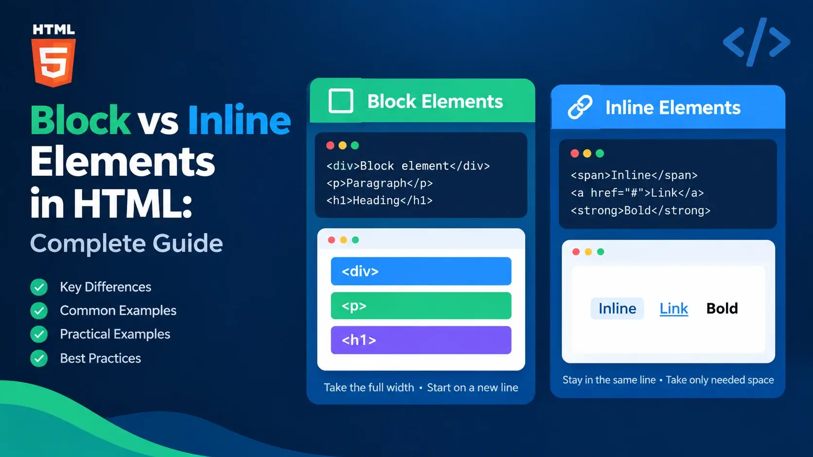
Every HTML element falls into one of two big categories: block-level or inline-level. This distinction determines how an element behaves on the page — whether it forces a line break, how wide it becomes, and how it interacts with the elements around it.
In this guide, you will learn what block and inline elements are, how they differ in
layout and the box model, which elements belong to each category, how to change behavior
with CSS display, and the nesting rules that follow. Every concept is paired
with a live example.
Quick Comparison at a Glance
If you want the fastest possible overview, this table captures the difference in a single glance. Everything after it is a deeper explanation.
| Aspect | Block | Inline |
|---|---|---|
| Line behavior | Starts on a new line | Flows with surrounding text |
| Default width | Full width of the parent | Only as wide as its content |
| Respects width / height | Yes | No |
| Vertical margins / padding | Applies fully | Does not affect line height |
| Can contain block elements? | Yes | No (with HTML5 exception) |
| Can contain inline elements? | Yes | Yes |
| Common elements | div, p, h1, ul, section |
span, a, strong, em, code |
| Default display value | block |
inline |
The next two sections explain each category on its own, and the rest of the guide digs into the deeper behavior.
What Are Block-Level Elements?
A block-level element is an element that starts on its own line and stretches to fill the entire width of its parent container by default. Every block element takes up a “block” of space on the page, and anything after it begins on a new line.
Think of block elements as paragraphs in a book. Each one occupies its own line, and the next one always starts below.
<!DOCTYPE html>
<html lang="en">
<head>
    <meta charset="UTF-8">
    <title>Block Elements</title>
    <style>
        body { font-family: system-ui, sans-serif; padding: 20px; background: #f8fafc; }
        div { background: #e0f7fa; padding: 12px 16px; margin-bottom: 8px; border-radius: 6px; }
        p { background: #fff8ec; padding: 12px 16px; border-radius: 6px; }
    </style>
</head>
<body>
    <div>First block element</div>
    <div>Second block element</div>
    <p>A paragraph, which is also a block element.</p>
</body>
</html>
Notice how each element starts on its own line and takes up the full width of the page, even though the content is short. That is the defining behavior of block elements.
What makes an element block-level?
- It always starts on a new line.
- It takes up the full available width of its parent by default.
- Its width and height can be set with CSS.
- All four margins and all four paddings apply normally.
- Another block element before or after it will stack vertically.
If you ever wonder whether an element is block or inline, drop two of them on the page and see whether they sit on separate lines. If they do, the element is block-level.
Common Block-Level Elements
These are the block elements you will meet constantly in real HTML. Each one serves a specific purpose, and they are the workhorses of page structure.
<div>
A generic block container with no semantic meaning. Used for grouping content.
<p>
A paragraph of text. The most common block element on almost every page.
<h1> to <h6>
Six levels of headings, from the most important (h1) to the least (h6).
<ul> and <ol>
Unordered and ordered lists. Each contains one or more list items.
<section>
A thematic grouping of content, usually with a heading.
<article>
Self-contained content that could stand alone, like a blog post.
<header> and <footer>
Introductory or closing content for a page or a section.
<nav>
A block of navigation links.
<main>
The primary content of the page. Only one per document.
<aside>
Content indirectly related to the main content — sidebars or callouts.
<table>
A data table with rows and columns.
<blockquote>
A block quotation from another source.
There are also block-level elements for forms, lists, and semantic layout. The list above covers the ones you will use most often.
What Are Inline-Level Elements?
An inline-level element is an element that flows within the surrounding text. It does not force a line break, and it takes up only as much width as its content requires.
Think of inline elements as words within a sentence. They sit next to each other on the same line, and the line only breaks when there is no more room.
<!DOCTYPE html>
<html lang="en">
<head>
    <meta charset="UTF-8">
    <title>Inline Elements</title>
    <style>
        body { font-family: system-ui, sans-serif; padding: 20px; background: #f8fafc; }
        p { line-height: 1.9; }
        span { background: #e0f7fa; padding: 2px 6px; border-radius: 4px; }
        strong { color: #0891b2; }
        em { color: #7c3aed; font-style: italic; }
    </style>
</head>
<body>
    <p>
        This is a paragraph with an
        <span>inline span</span>, a
        <strong>bold phrase</strong>, and an
        <em>italic word</em> flowing inside it.
    </p>
</body>
</html>
Every inline element sits inside the sentence. The line only breaks where the browser runs out of room — not because of any element.
What makes an element inline-level?
- It does not force a line break before or after.
- It takes up only as much width as its content requires.
- It flows alongside other inline elements and text.
- Its width and height are ignored by the browser.
- Only left and right margins and left and right padding affect the layout.
If two elements sit side by side on the same line, and they look like words in a sentence, they are probably inline-level. If they stack, they are probably block-level.
Common Inline-Level Elements
These are the inline elements you will use most often. Each one is designed to be placed inside a block element like a paragraph or a heading.
<a>
A hyperlink. Flows inline, usually inside a paragraph or a heading.
<span>
A generic inline container with no semantic meaning. Used for styling.
<strong>
Strong importance. Typically rendered bold, but the meaning is emphasis.
<em>
Emphasized text. Typically rendered italic, but the meaning is emphasis.
<code>
A short snippet of code inside a line of prose. Rendered in monospace.
<small>
Smaller text, usually for fine print or side notes.
<mark>
Highlighted text for reference — like a highlighter on paper.
<abbr>
An abbreviation or acronym, often paired with a title attribute.
<cite>
A reference to a creative work — a book, article, or film.
<img>
An image. Inline-level by default, but a replaced element.
<br>
A line break within the current block of text.
<button>
A clickable button. Behares as inline-block by default in most browsers.
Some elements like img and button are technically inline-level
but behave like inline-block — they accept width and height and can be sized. This is
why they seem to sit “in between” the two categories.
How They Behave Differently
The simplest way to see the difference is to place the same content in block and inline elements and observe the result.
The block elements stack vertically, each starting on its own line and stretching to fill the container. The inline elements sit side by side on the same line, taking only the space they need.
A closer look at width
Block elements stretch to fill their container even if their content is short. This is why a block element with the word “hi” takes up the same width as one with a full sentence.
<!DOCTYPE html>
<html lang="en">
<head>
    <meta charset="UTF-8">
    <title>Block Width Behavior</title>
    <style>
        body { font-family: system-ui, sans-serif; padding: 20px; background: #f8fafc; }
        .block { background: #e0f7fa; padding: 10px 14px; margin-bottom: 8px; border-radius: 6px; }
        .inline { background: #ede9fe; padding: 3px 8px; border-radius: 4px; }
    </style>
</head>
<body>
    <p>A block element with short text:</p>
    <div class="block">Hi</div>

    <p>An inline element with short text:</p>
    <p><span class="inline">Hi</span></p>
</body>
</html>
The block div fills the entire width even though it contains only “Hi”. The inline span takes only the width of the two letters.
A quick way to see which elements are block or inline: add a background color to each and watch how it spreads. Block elements color the full width; inline elements color only their content.
Box Model Differences
Block and inline elements behave differently in the CSS box model. This is important when you start styling with margins and padding.
| Property | Block | Inline |
|---|---|---|
| width / height | Applies | Ignored |
| margin-top / margin-bottom | Applies, pushes other blocks | Does not affect line height |
| margin-left / margin-right | Applies | Applies, pushes neighbors |
| padding-top / padding-bottom | Applies, expands the block | Applies visually, may overlap lines |
| padding-left / padding-right | Applies | Applies, pushes neighbors |
| border | Applies on all sides | Applies on all sides |
The most surprising part for beginners is that inline elements ignore
width, height, margin-top, and
margin-bottom. If you try to set a width on an inline element, nothing
happens.
<!DOCTYPE html>
<html lang="en">
<head>
    <meta charset="UTF-8">
    <title>Inline Ignores Width</title>
    <style>
        body { font-family: system-ui, sans-serif; padding: 20px; background: #f8fafc; }
        .inline {
            display: inline;
            width: 300px;
            height: 100px;
            background: #ede9fe;
            padding: 4px 8px;
        }
        .block {
            display: block;
            width: 300px;
            height: 100px;
            background: #e0f7fa;
            padding: 10px 14px;
            margin-top: 12px;
            border-radius: 6px;
        }
    </style>
</head>
<body>
    <p>
        An inline element with width 300px and height 100px:
        <span class="inline">Look at me</span>
        — nothing happens.
    </p>
    <div class="block">A block element with the same width and height.</div>
</body>
</html>
The inline span ignores the width and height entirely. The block div respects them. This is a fundamental difference between the two categories.
If you want an element to flow inline and accept width and height, use
display: inline-block. It gets the best of both worlds.
How They Flow on the Page
Block and inline elements participate in the normal document flow in different ways. The browser has two flow rules it follows when laying out a page.
Block flow
Block elements stack like boxes on a shelf. Each one takes up its own row, and the next one starts below. Vertical margins between them are respected and can even overlap in a process called margin collapsing.
Inline flow
Inline elements flow like words in a paragraph. They sit next to each other on the same line until there is no room left, and then they wrap to the next line. Between two inline elements, the browser renders a single space if there is any whitespace in the source.
<!DOCTYPE html>
<html lang="en">
<head>
    <meta charset="UTF-8">
    <title>Flow Behavior</title>
    <style>
        body { font-family: system-ui, sans-serif; padding: 20px; background: #f8fafc; }
        .block { background: #e0f7fa; padding: 10px 14px; border-radius: 6px; margin-bottom: 8px; }
        .inline { background: #ede9fe; padding: 3px 8px; border-radius: 4px; }
    </style>
</head>
<body>
    <h2>Block flow: each element on its own line</h2>
    <div class="block">Block one</div>
    <div class="block">Block two</div>
    <div class="block">Block three</div>

    <h2>Inline flow: elements sit side by side</h2>
    <p>
        <span class="inline">Inline one</span>
        <span class="inline">Inline two</span>
        <span class="inline">Inline three</span>
        — see how they flow together on the same line.
    </p>
</body>
</html>
This is the most fundamental behavior in HTML layout. Once you internalize it, you will predict how almost any page will look before you open it in a browser.
Nesting Rules for Block and Inline
Block and inline elements have a specific set of allowed relationships. Getting these wrong is one of the most common beginner mistakes.
| Container | Can contain block? | Can contain inline? |
|---|---|---|
| Block element | Yes | Yes |
| Inline element | No (with HTML5 exception for a) |
Yes |
The rule is simple: block can contain anything, inline can only contain inline.
Valid: inline inside block
Placing inline elements inside block elements is standard, valid HTML. This is what happens constantly in real code.
<p>
    This is a <strong>bold phrase</strong> and an
    <a href="https://inarlearn.com">inline link</a>
    inside a paragraph.
</p>
Invalid: block inside inline
Placing block elements inside inline elements is invalid HTML. Browsers will silently restructure the DOM.
<span>
    <div>A block element</div>
</span><div>
<span>An inline element</span>
</div>
The browser will move the <div> outside the <span>
when it builds the DOM. The page still renders, but the tree no longer matches your markup,
which can break CSS selectors and JavaScript lookups.
In HTML5, an <a> element is allowed to wrap block-level content —
like a full card with a heading and paragraph. This was invalid in HTML4. Use it
carefully, because it can create confusing click targets for users.
Changing Display with CSS
The block vs inline behavior of any element can be changed with the CSS
display property. This is one of the most powerful tools in CSS.
Makes the element behave as a block — new line, full width, accepts width and height.
Makes the element flow inline — no line break, only content width, ignores width and height.
A hybrid — flows inline but accepts width, height, and vertical margins and padding.
Removes the element from the page entirely. It takes up no space and is not rendered.
Turns the element into a flex container. Its children are laid out with flexbox.
Turns the element into a grid container. Its children are laid out with CSS grid.
Example: making a link behave like a block
<!DOCTYPE html>
<html lang="en">
<head>
    <meta charset="UTF-8">
    <title>Display Block on a Link</title>
    <style>
        body { font-family: system-ui, sans-serif; padding: 20px; background: #f8fafc; }
        a {
            display: block;
            padding: 12px 16px;
            margin-bottom: 8px;
            background: #e0f7fa;
            color: #0e7490;
            text-decoration: none;
            border-radius: 6px;
            font-weight: 600;
        }
    </style>
</head>
<body>
    <a href="https://inarlearn.com/">Home</a>
    <a href="https://inarlearn.com/what-is-html/">What Is HTML?</a>
    <a href="https://inarlearn.com/html-syntax/">HTML Syntax</a>
</body>
</html>
By default, <a> is inline. With display: block, each link
becomes a full-width, clickable block — the classic pattern for a vertical navigation menu.
Whether an element is block or inline in the HTML spec, you can always change it in CSS. What matters most is choosing the right semantic element first, then styling it as needed.
Inline-Block: A Middle Ground
display: inline-block is a hybrid of both categories. It combines the best
behavior of each.
- From inline: It flows on the same line as other elements. It does not force a line break.
- From block: It accepts width, height, and vertical margins and padding.
This makes it perfect for buttons, navigation items, tags, or any content that should sit side by side while also having a defined box.
<!DOCTYPE html>
<html lang="en">
<head>
    <meta charset="UTF-8">
    <title>Inline-Block Example</title>
    <style>
        body { font-family: system-ui, sans-serif; padding: 20px; background: #f8fafc; }
        .tag {
            display: inline-block;
            padding: 6px 14px;
            margin: 4px;
            background: #0891b2;
            color: #fff;
            border-radius: 999px;
            font-size: 13px;
            font-weight: 600;
        }
    </style>
</head>
<body>
    <h1>Inline-block tags</h1>
    <span class="tag">HTML</span>
    <span class="tag">CSS</span>
    <span class="tag">JavaScript</span>
    <span class="tag">Accessibility</span>
    <span class="tag">SEO</span>
    <span class="tag">Performance</span>
</body>
</html>
Each tag flows inline — the tags sit side by side on the same line — while also respecting
its padding and margin. This is exactly what inline-block is for.
Inline-block elements separated by whitespace in the source render with a small gap between them. This is the “inline-block whitespace gap” — one of the most famous quirks in HTML. Flexbox is the modern way to avoid it.
Common Mistakes
A handful of block vs inline mistakes show up again and again in beginner code. Here are the ones to watch for.
1. Nesting a block element inside an inline element
<span>
    <div>A block element</div>
</span><div>
<span>An inline element</span>
</div>2. Trying to set width or height on an inline element
span {
    width: 200px;
    height: 50px;
}span {
display: inline-block;
width: 200px;
height: 50px;
}3. Expecting inline elements to stack vertically
<span>One</span>
<span>Two</span>

<!-- Renders side by side, not stacked --><div>One</div>
<div>Two</div>4. Using <br> to separate block elements
<p>First</p>
<br>
<p>Second</p><p>First</p>
<p>Second</p>5. Using inline elements for layout
<span style="display: block; width: 300px;">
A card
</span><div>
A card
</div>6. Forgetting the inline-block whitespace gap
<span>One</span>
<span>Two</span>
<!-- Renders with a small gap --><span>One</span><span>Two</span>7. Assuming block elements cannot sit side by side
Block elements stack by default, but they can sit side by side with flexbox or grid. This is not a conflict — it is the whole point of those CSS layout systems.
<div>One</div>
<div>Two</div>
<!-- Stacks vertically --><div style="display: flex;">
<div>One</div>
<div>Two</div>
</div>The W3C Markup Validation Service will catch block-inside-inline errors and other structural issues. Running your page through it before publishing is a habit worth building.
Best Practices
A few habits make your HTML cleaner, more accessible, and easier to style.
Choose semantic elements
Use p for paragraphs, nav for navigation, button for buttons — not div for everything.
Inline inside block
The natural order is block containers holding inline content. Follow it unless you have a reason not to.
Use CSS for layout
Flexbox and grid handle layout. Do not fight the default block/inline behavior of elements.
Prefer inline-block over hacks
If an element needs width and height but flows inline, use display: inline-block instead of workarounds.
Validate your HTML
Run your page through the W3C validator to catch structural errors early.
Inspect the DOM
Use DevTools to check how the browser actually structured your page. If it looks different from your source, something was invalid.
Choose the element that best describes your content, then use CSS to make it look and
behave however you want. Never choose a <div> over a
<p> just because you like the default styling.
Frequently Asked Questions
1. What is the difference between block and inline elements in HTML?
Block elements start on a new line, take up the full width of their container by default, and stack vertically. Inline elements do not force a line break, take up only as much width as their content requires, and flow within the surrounding text.
2. Which HTML elements are block-level?
Common block-level elements include div, p,
h1 through h6, ul, ol,
li, section, article, header,
footer, nav, main, aside,
form, table, blockquote, and pre.
3. Which HTML elements are inline-level?
Common inline-level elements include span, a,
strong, em, b, i, u,
small, code, mark, sub,
sup, abbr, cite, q,
time, label, and the void elements br,
img, input, and button.
4. Can a block element be placed inside an inline element?
In general no. Block elements cannot be nested inside inline elements. There is one modern exception: an anchor element can wrap block-level content in HTML5, but this should be used carefully because it can create accessibility issues.
5. Can an inline element be placed inside a block element?
Yes. This is standard, valid HTML. Putting inline elements like span,
strong, or a inside block elements like p or
div is what happens constantly in real HTML.
6. Do block elements always take up the full width?
By default yes — a block element stretches to fill the width of its parent container.
You can change this with CSS by setting a specific width or using
display: inline-block or display: inline.
7. How do I change a block element to inline?
Use the CSS display property. Setting display: inline makes
a block element behave like an inline element. Setting display: block on
an inline element makes it behave like a block.
8. What is inline-block in CSS?
display: inline-block is a hybrid. The element flows inline (like inline
elements) but respects width, height, top and bottom margins, and top and bottom
padding (like block elements). It is often used for buttons, navigation items, and
cards laid out in a row.
9. Why do inline elements ignore width and height?
Inline elements are meant to flow with text, so the browser does not apply width and
height to them. If you need width and height on an element that flows inline, use
display: inline-block instead.
10. Do block and inline elements affect the box model differently?
Yes. Block elements respect all four margins and all four paddings. Inline elements only respect left and right margins and left and right padding — top and bottom margins and padding do not affect the line height, though the padding can visually overlap adjacent lines.
11. What happens if I nest a block element inside an inline element anyway?
Browsers will still render the page, but they will silently restructure the DOM. The block element will be moved outside the inline element, which often breaks CSS selectors, JavaScript lookups, and accessibility.
12. Are img and button block or inline?
Both img and button are inline-level by default.
img is a replaced inline element and behaves a bit like inline-block for
sizing. button is inline-block by default in most browsers.
Key Takeaways
- Block elements start on a new line, take up full width, and stack vertically.
- Inline elements flow with text, take up content width, and do not force line breaks.
- Block elements respect width, height, and all margins and paddings. Inline elements ignore width, height, and vertical margins.
- Block elements can contain inline elements. Inline elements cannot contain block elements (with the HTML5 anchor exception).
- The CSS
displayproperty can change any element’s behavior:block,inline,inline-block, ornone. display: inline-blockis a hybrid — it flows inline while respecting width, height, and vertical spacing.- Common block elements include
div,p,h1–h6,ul,section, andarticle. - Common inline elements include
span,a,strong,em, andcode. - Choose the element that best describes your content — then use CSS for layout and styling.
- Validate your HTML to catch block-inside-inline errors early.
What to Learn Next
Now that you understand block and inline elements, the next step is to practice them with real structure. Start with HTML Syntax Explained and HTML Nesting Explained for the foundational rules.
For deeper coverage, explore HTML Elements, HTML Attributes, and Whitespace in HTML. To see how the browser renders these layouts, read How Web Browsers Work and How Websites Work.
Practice Challenge
Build a small HTML page that demonstrates the difference between block and inline elements. Your page should include:
- Three block-level elements stacked vertically with visible borders
- The same content inside inline elements, side by side on the same line
- A paragraph containing at least three different inline elements (like
strong,em, anda) - An inline element changed to block with
display: block - A block element changed to inline with
display: inline - A group of elements with
display: inline-blockarranged side by side
Once your page renders, take a screenshot or open it in DevTools. Notice how each element
flows, how their widths differ, and how changing display transforms the
layout. If you can explain why each one behaves the way it does, you have mastered the
block vs inline distinction.

 Inar Learn